The Stacks
Completed Date
2025
Industry
Apartment / Mixed-Use
Discipline
Experiential Design
The Stacks was envisioned as “eclectic while approachable” – a development with a neighborhood feel. And the three apartment buildings within in it line the sides of a scenic promenade inspired by European cities.
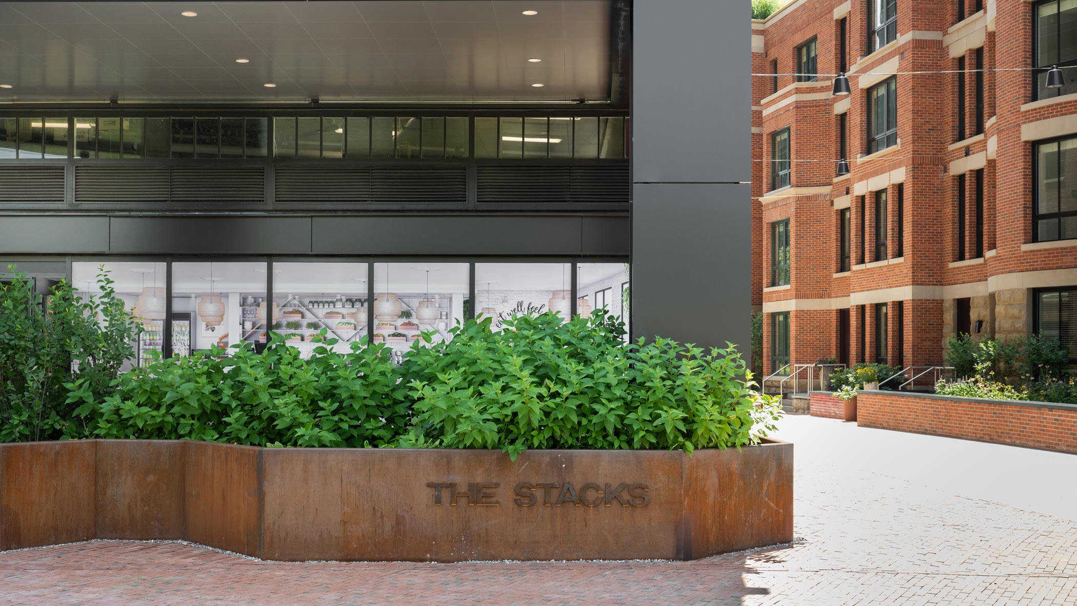

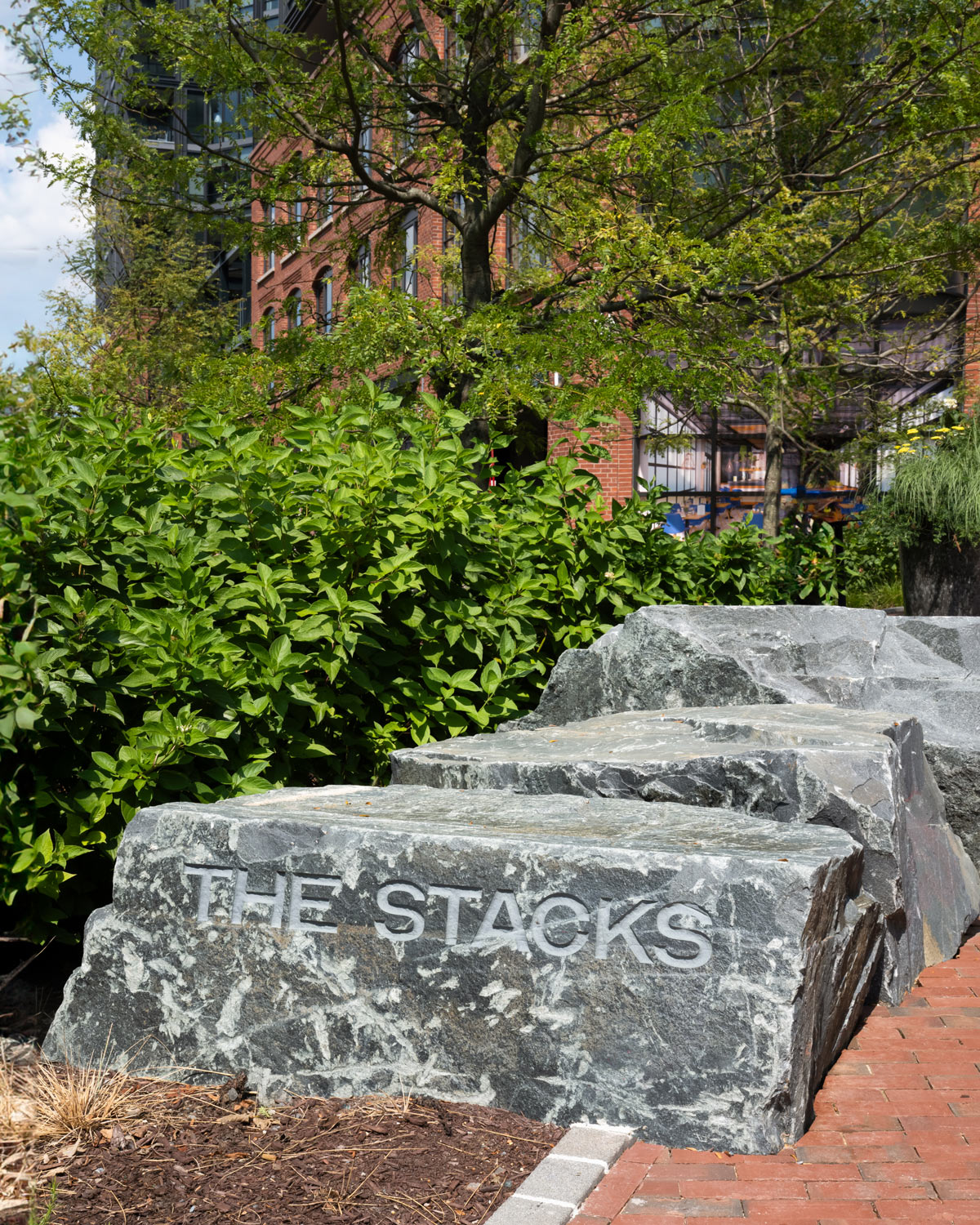
At entrances to the Stacks, YDI integrated the name of the development into landscaping elements: mounted on the steel wall of a planter, and carved out of stone. These understated signs blend into natural materials to create a seamless branded experience.

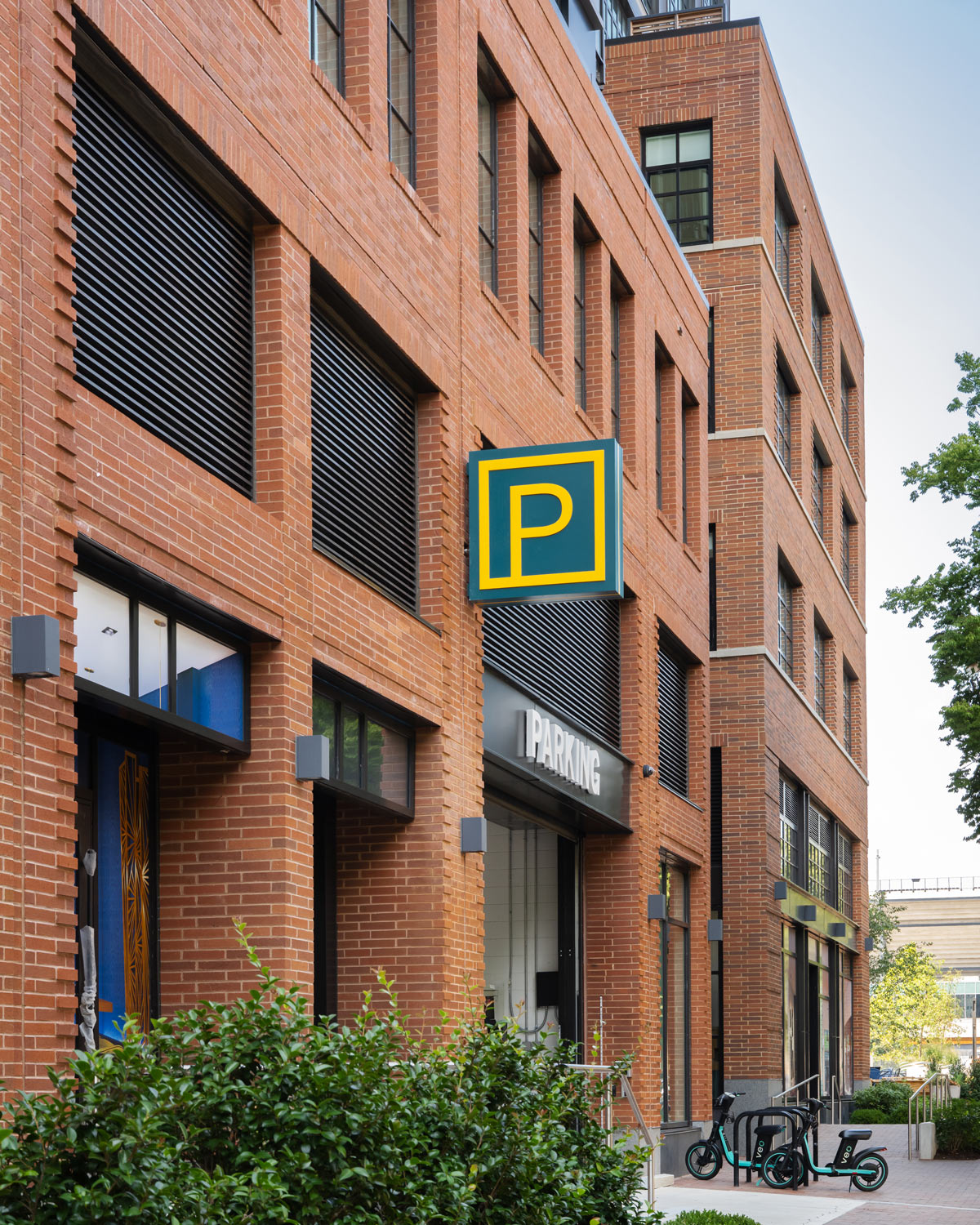
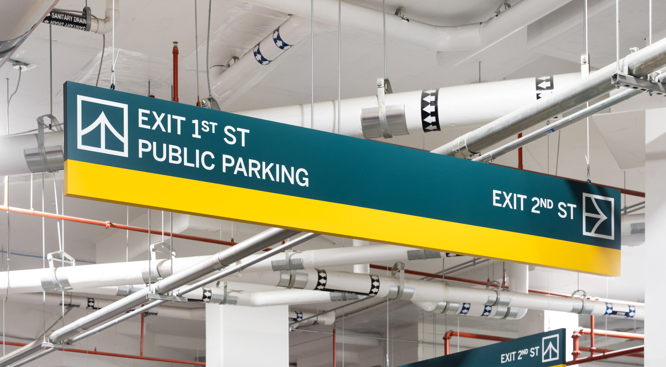
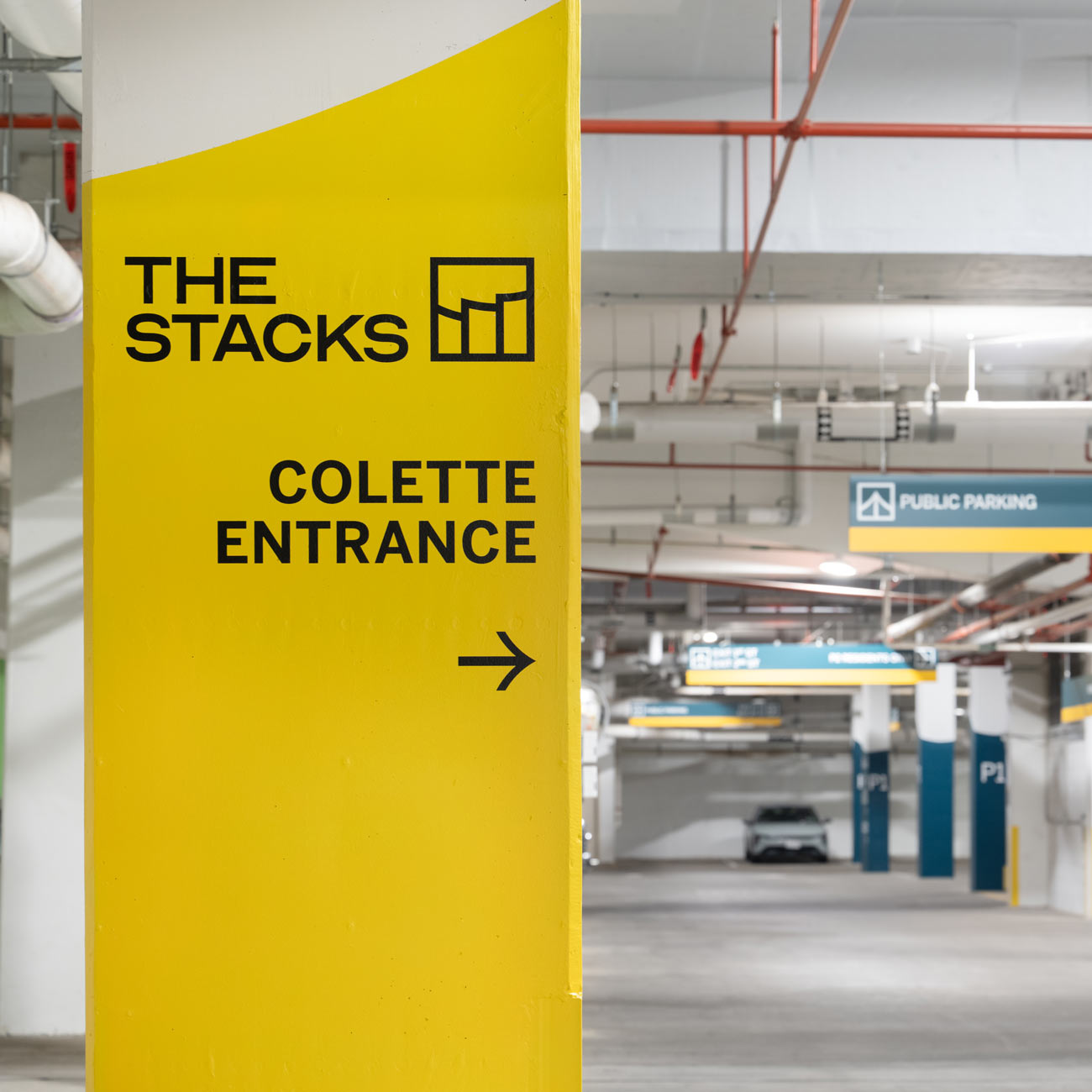
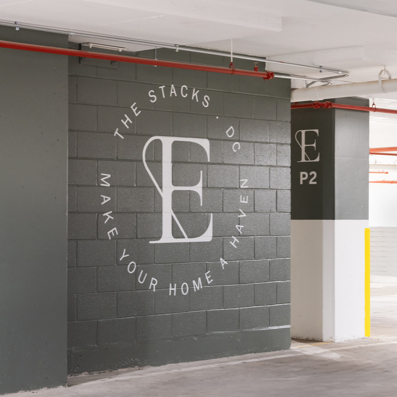
The extensive parking garage serving all three buildings at The Stacks features playful murals and splashes of color, paired with helpful directional messages to guide residents to their homes. In addition to livening up the space, color helps delineate the many destinations accessible through the garage.
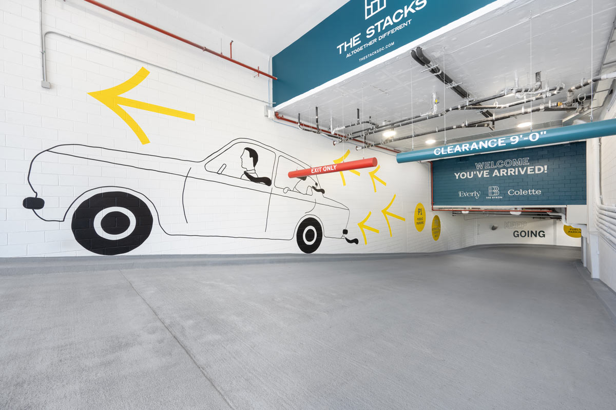
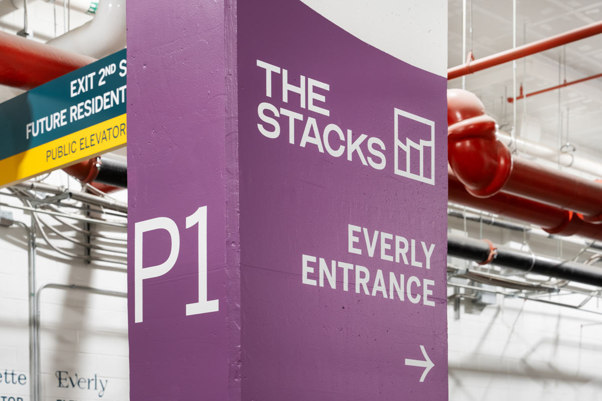
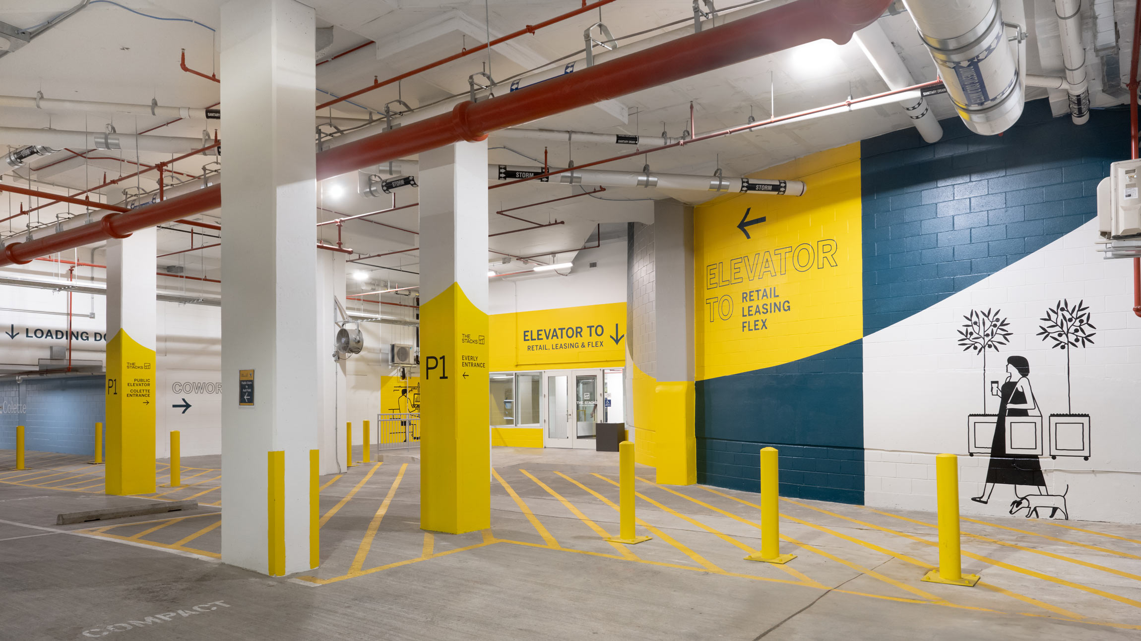
YDI navigated a complex wayfinding challenge and developed messaging for the entire parking garage while also brightening up the environment with large fields of color and illustrative graphics inspired by the glyph family from the Everly building.
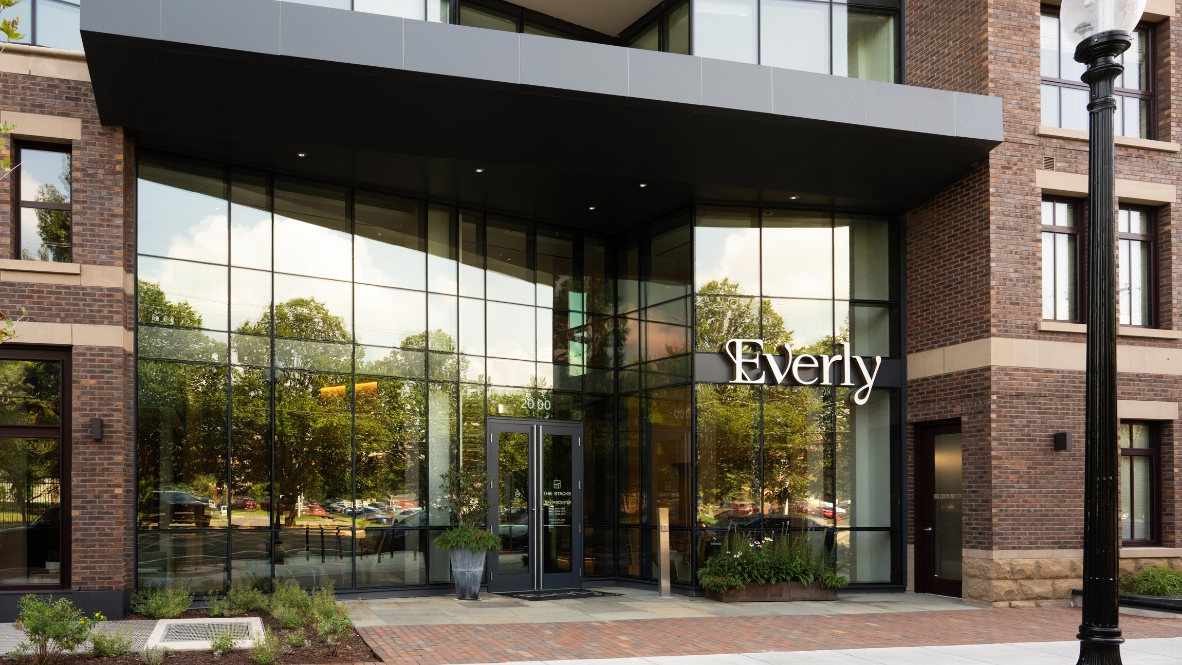
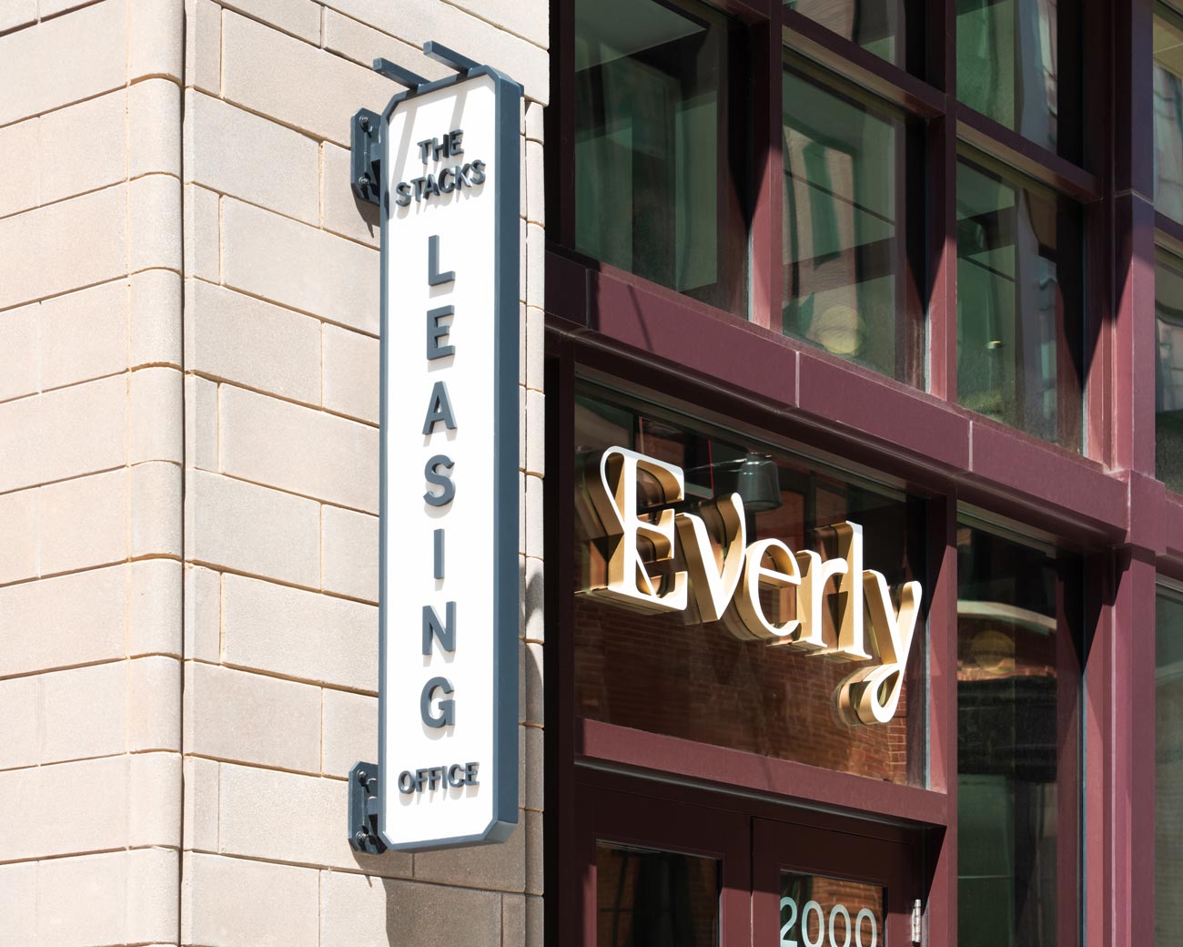
The third apartment building at The Stacks, Everly, features illuminated identity signage designed by YDI, as well as a vertical blade sign denoting the leasing office for the whole development. Variations in each of The Stacks’ buildings’ entrances presented an exciting challenge for YDI, to integrate identity signage seamlessly into the architecture.


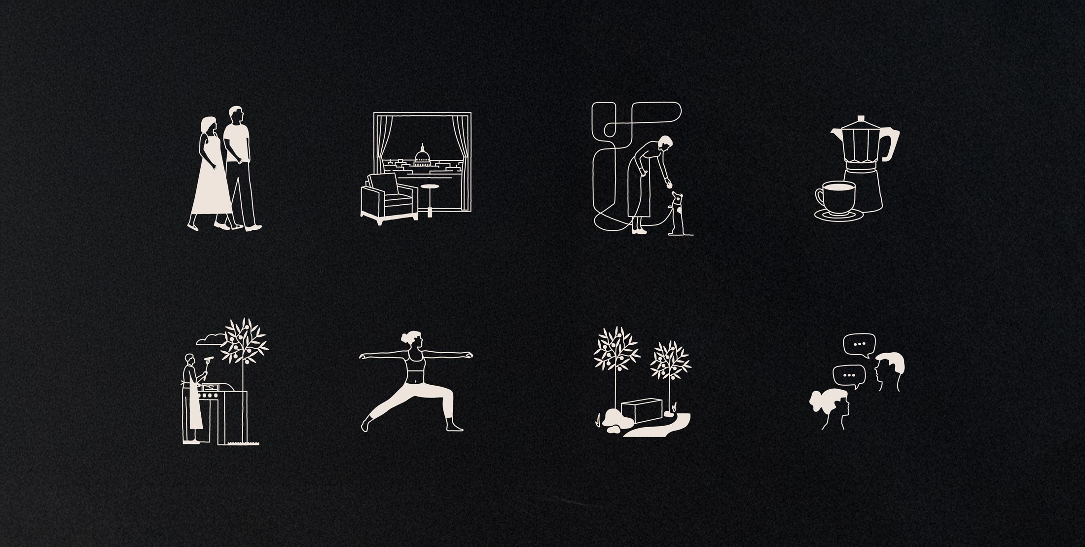
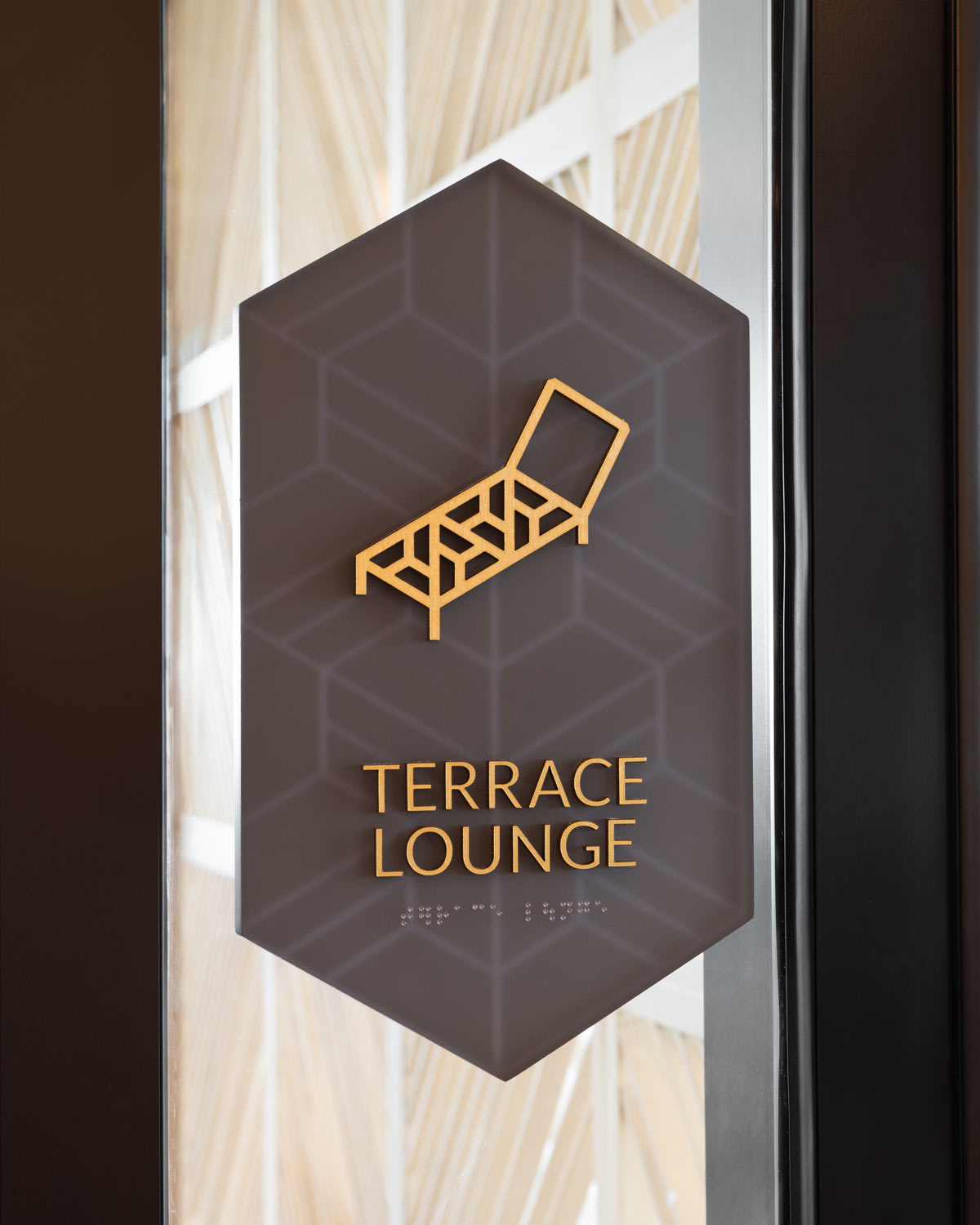
Simple ADA sign panels, constructed of premium materials, allow the playfulness of these expressive glyphs to take the main focus. YDI took inspiration from Everly’s brand illustrations and designed an extended family of glyphs for interior signage to fit its look and feel.
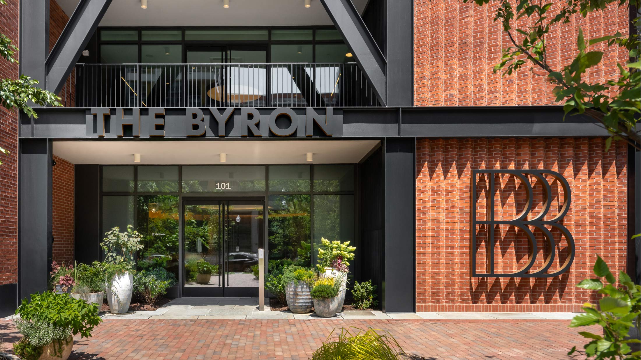
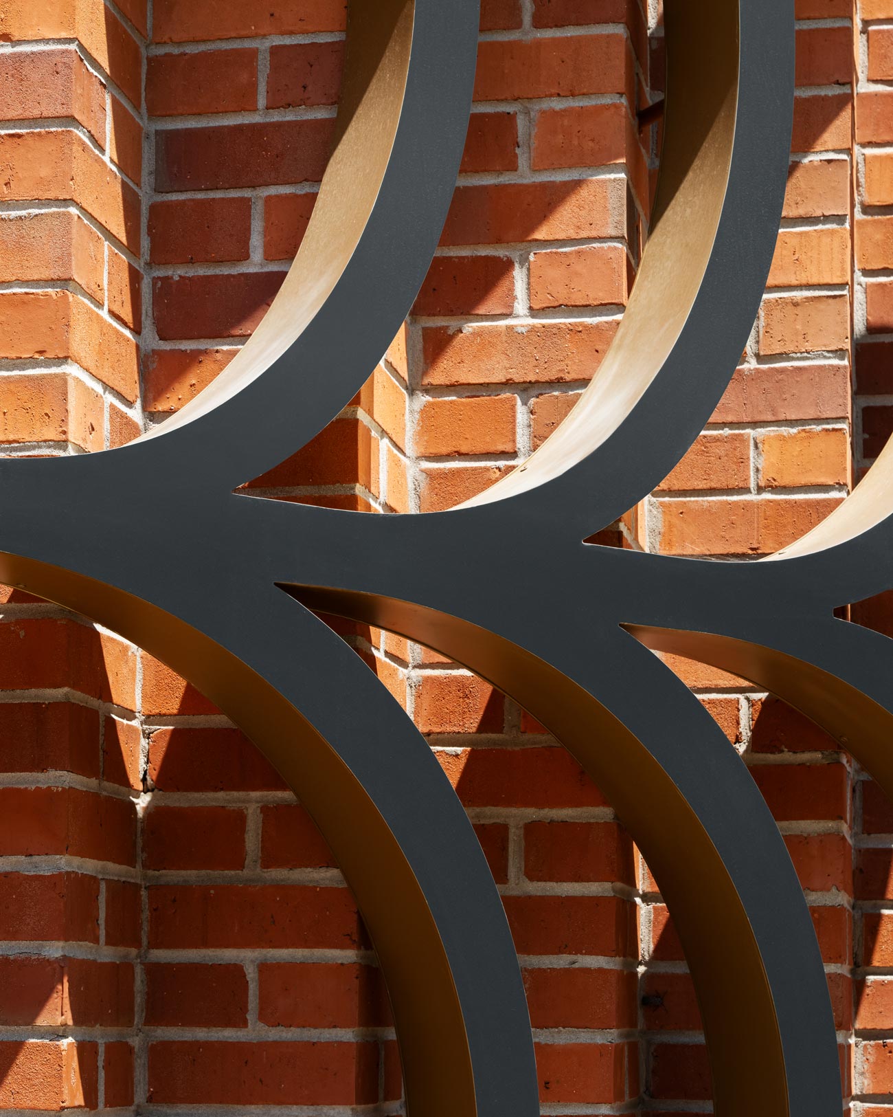
At the Byron, an apartment building with an emphasis on understated elegance, YDI designed halo-lit metal raceway signage at this secondary entrance. Nearby, a large-scale dimensional “B” logo sign throws playful shadows on angled sections of a brick wall.
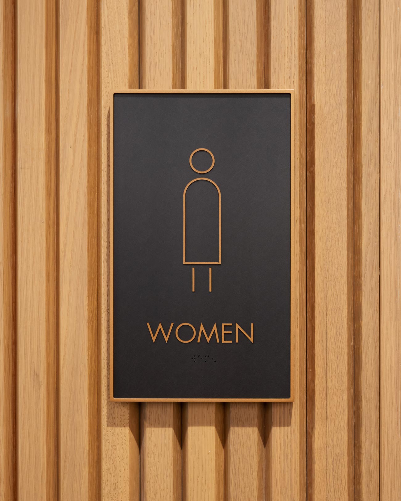
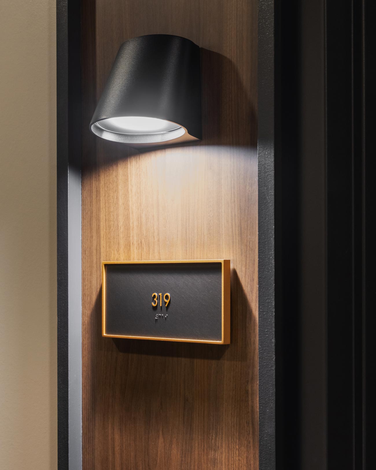
Interior signage is upscale and minimal, with simple glyphs and an emphasis on materials that pair well with the building’s elegant finishes – the metallic veneer used on panels echoes the use of metal in the building’s interior. The gentle curves in glyph illustrations reference an ‘arch’ motif in the Byron brand. YDI designed signs that feel right at home with both the existing brand of the building and its interior design.
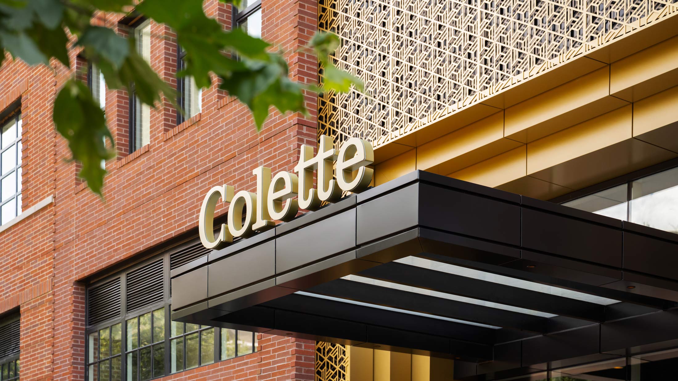
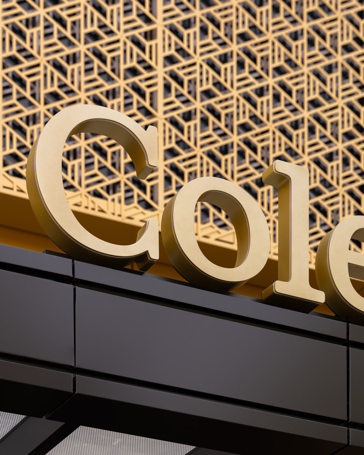
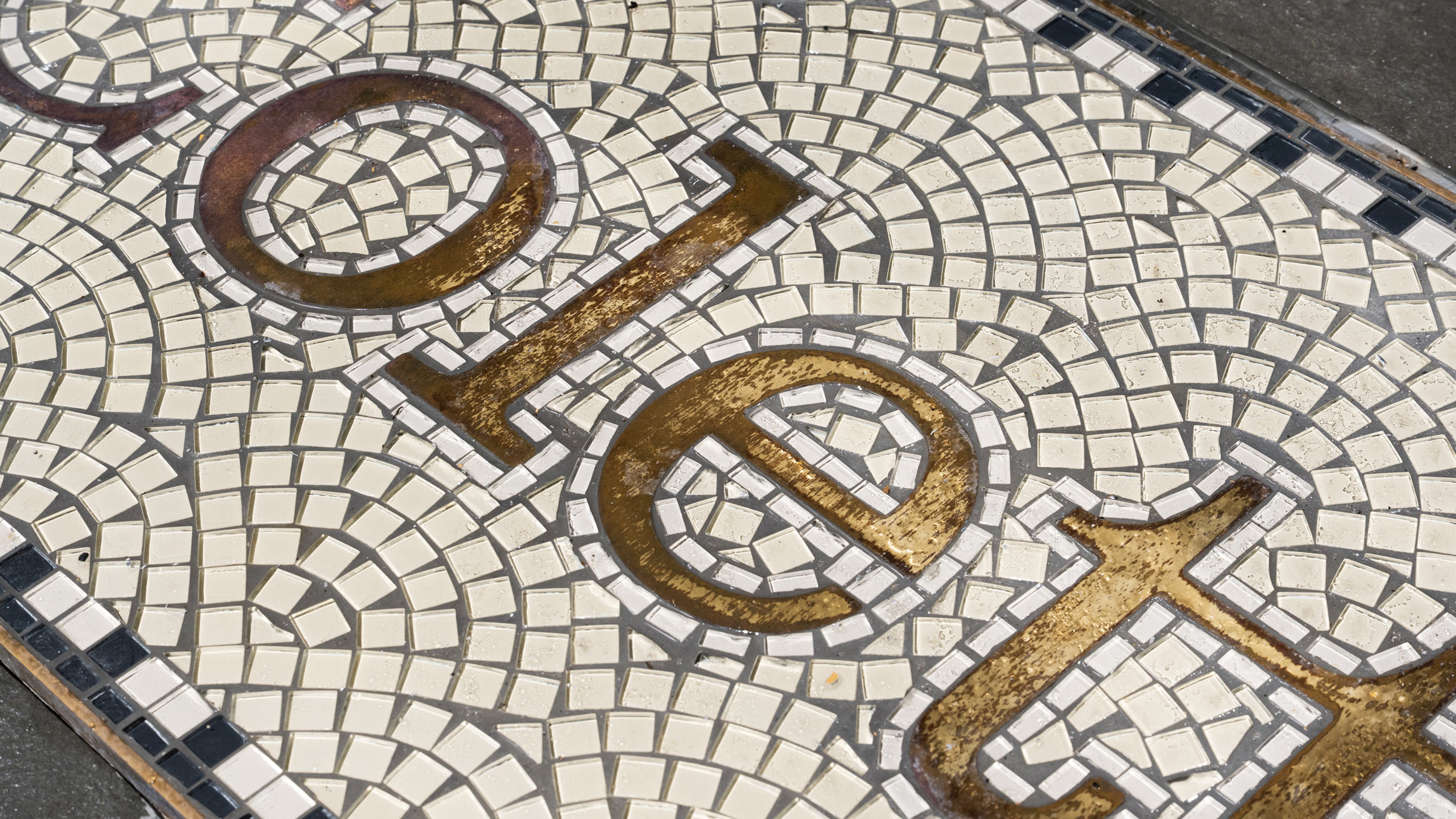
A YDI-designed raceway sign at the entrance to Colette, another of the Stacks’ residences, is set against a backdrop of intricate brand patterns on the building’s facade. A brass version of the building’s name was also inlaid in a custom mosaic on the ground outside. Signs such as these represent a concerted effort to organically incorporate signage into the Stacks’ architecture.
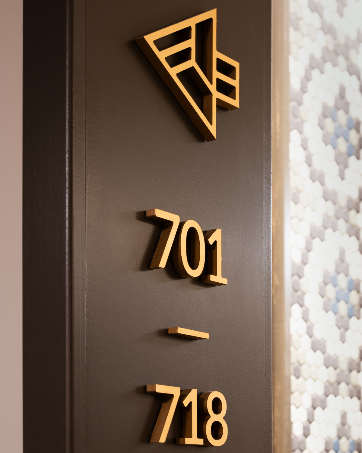
Colette’s complex brand patterns served as inspiration for interior signage, as well. YDI translated this geometry into amenity glyphs and arrows, as well as a back-printed pattern on ADA signage throughout the building.
Boulder & Granite Engraving:
Corten Steel Signage:
Painted Graphics:
Williams Professional Painting & Contracting