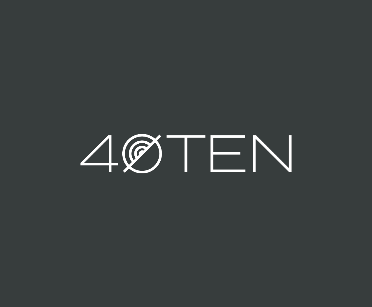
40Ten
Completed Date
2024
Industry
Office / Education
Discipline
Experiential DesignBrand Design

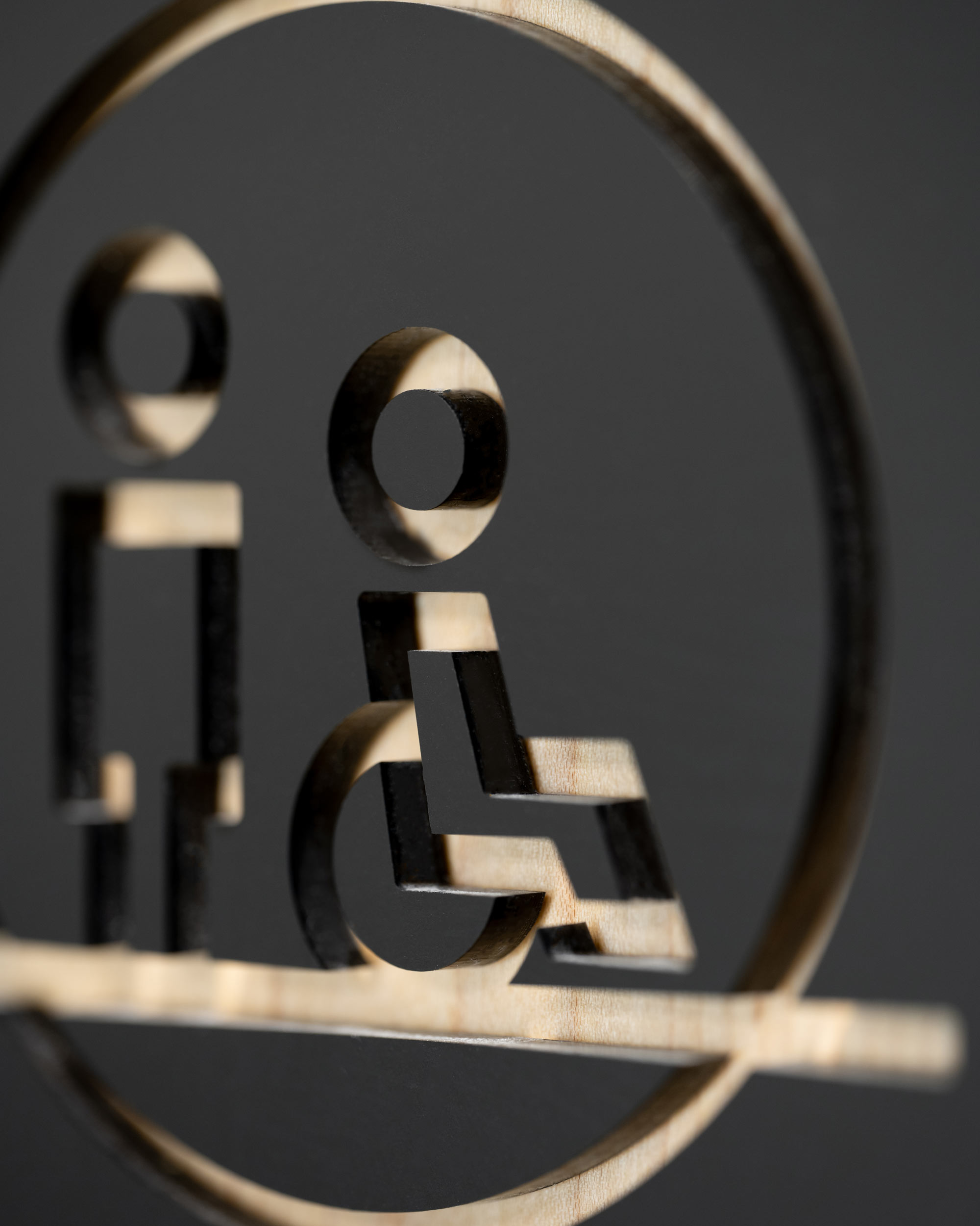
An expressive family of circular icons brings 40Ten’s brand into the physical space, from large signage such as the mixed-use building’s primary identity, to small panels at every interior door. These simple yet evocative glyphs give the project a distinct personality while also serving an important informative role.
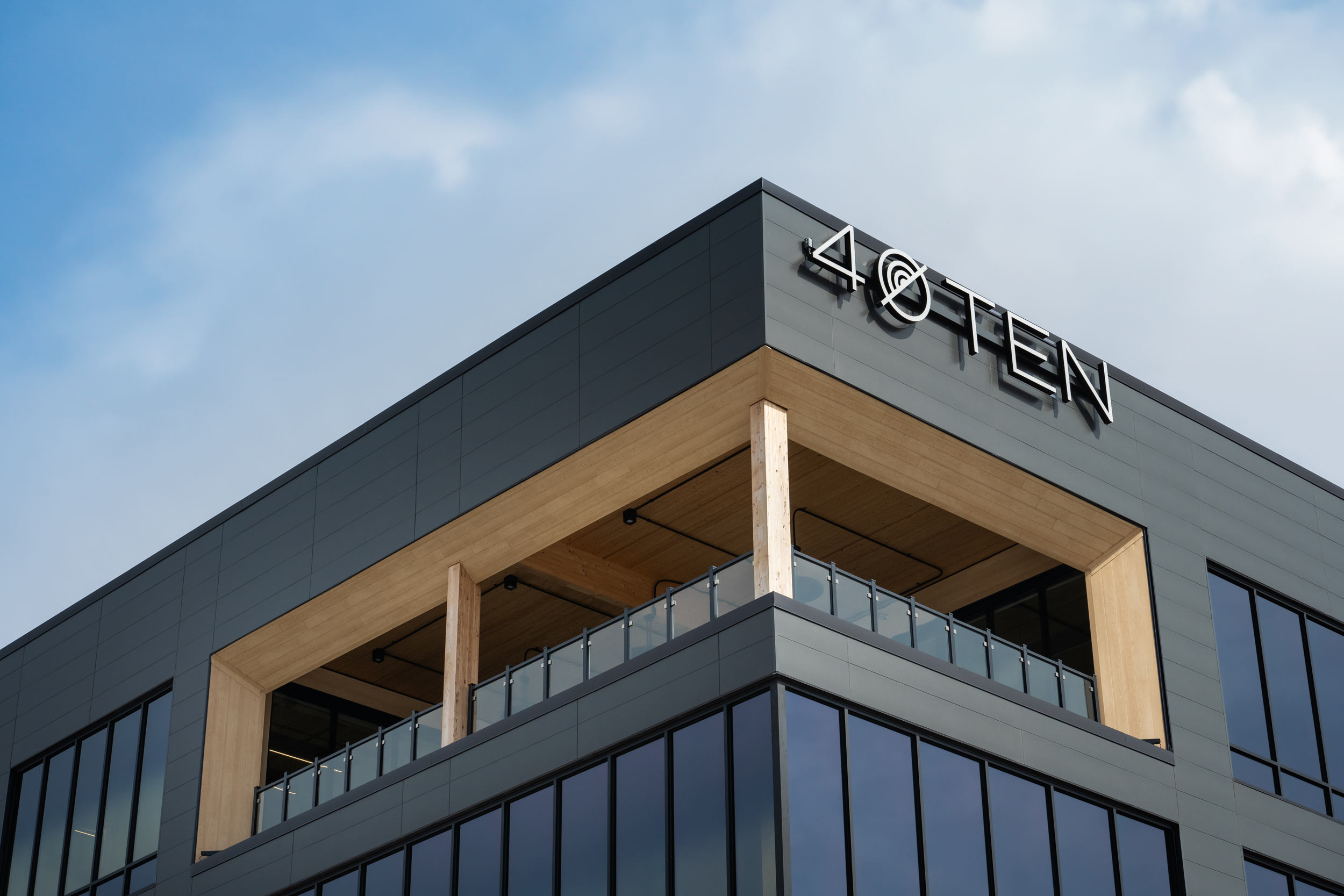
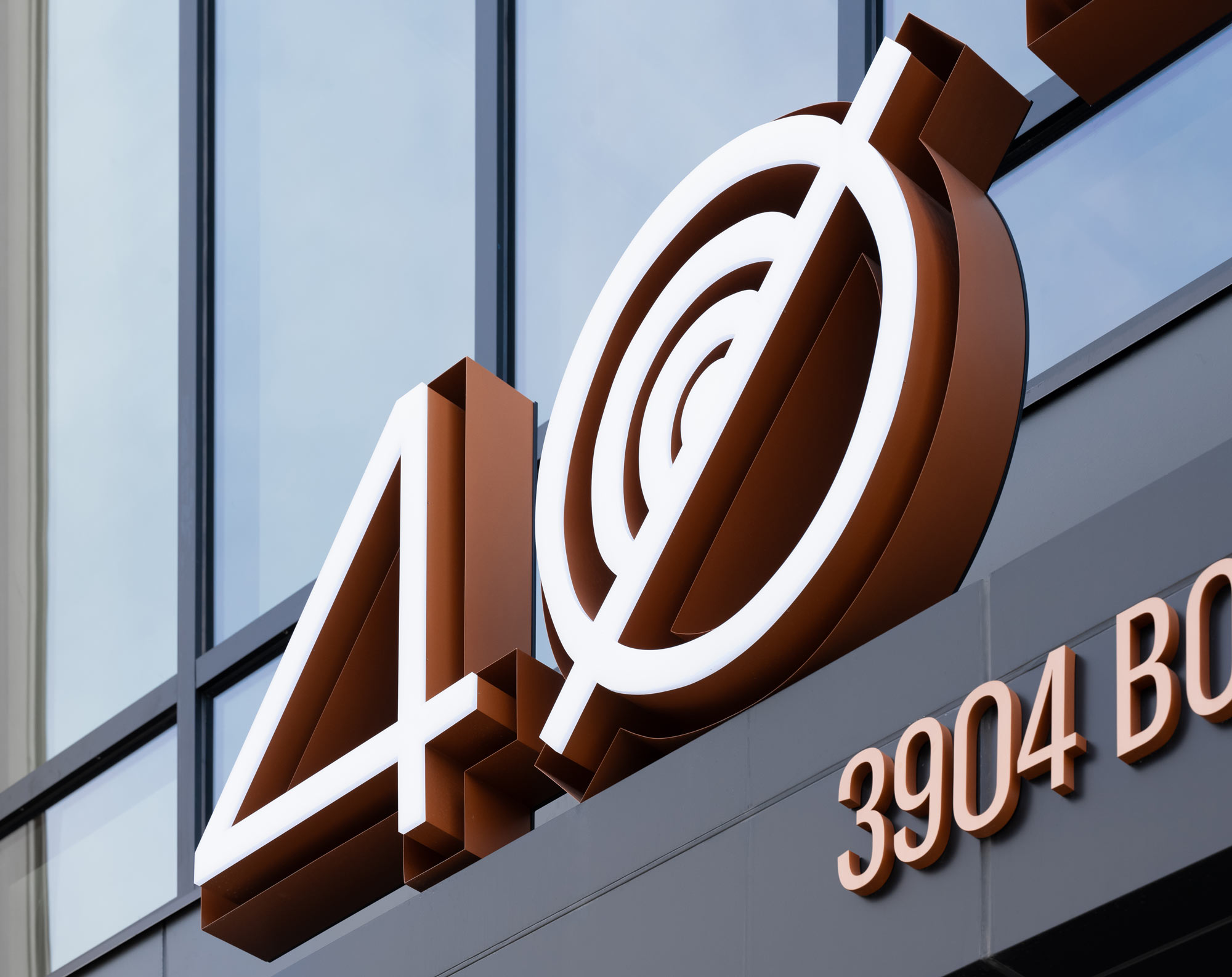
The primary identity sign for 40Ten is constructed of face-lit, reverse channel letters with bronze-painted returns, giving it extra dimension and texture. It incorporates one of the custom glyphs from the building’s icon system into the zero, which represents the rings of growth within a tree trunk.
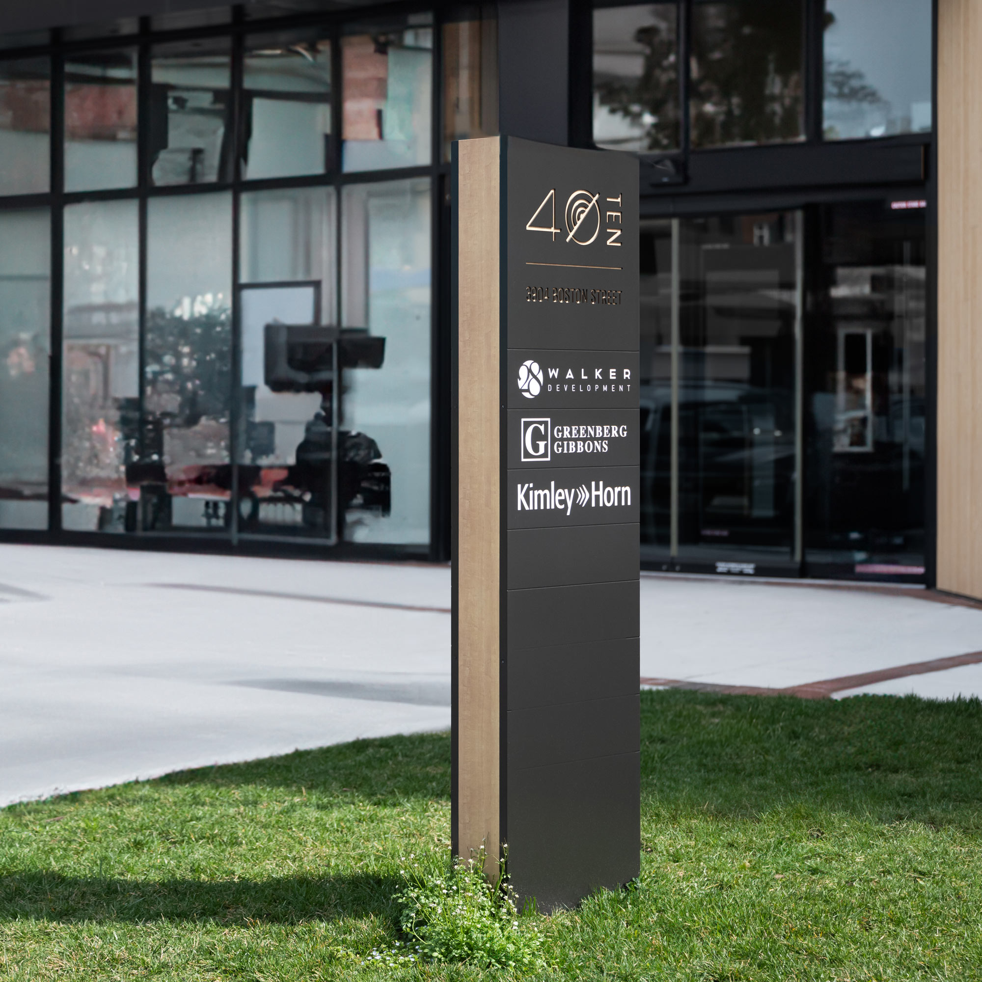
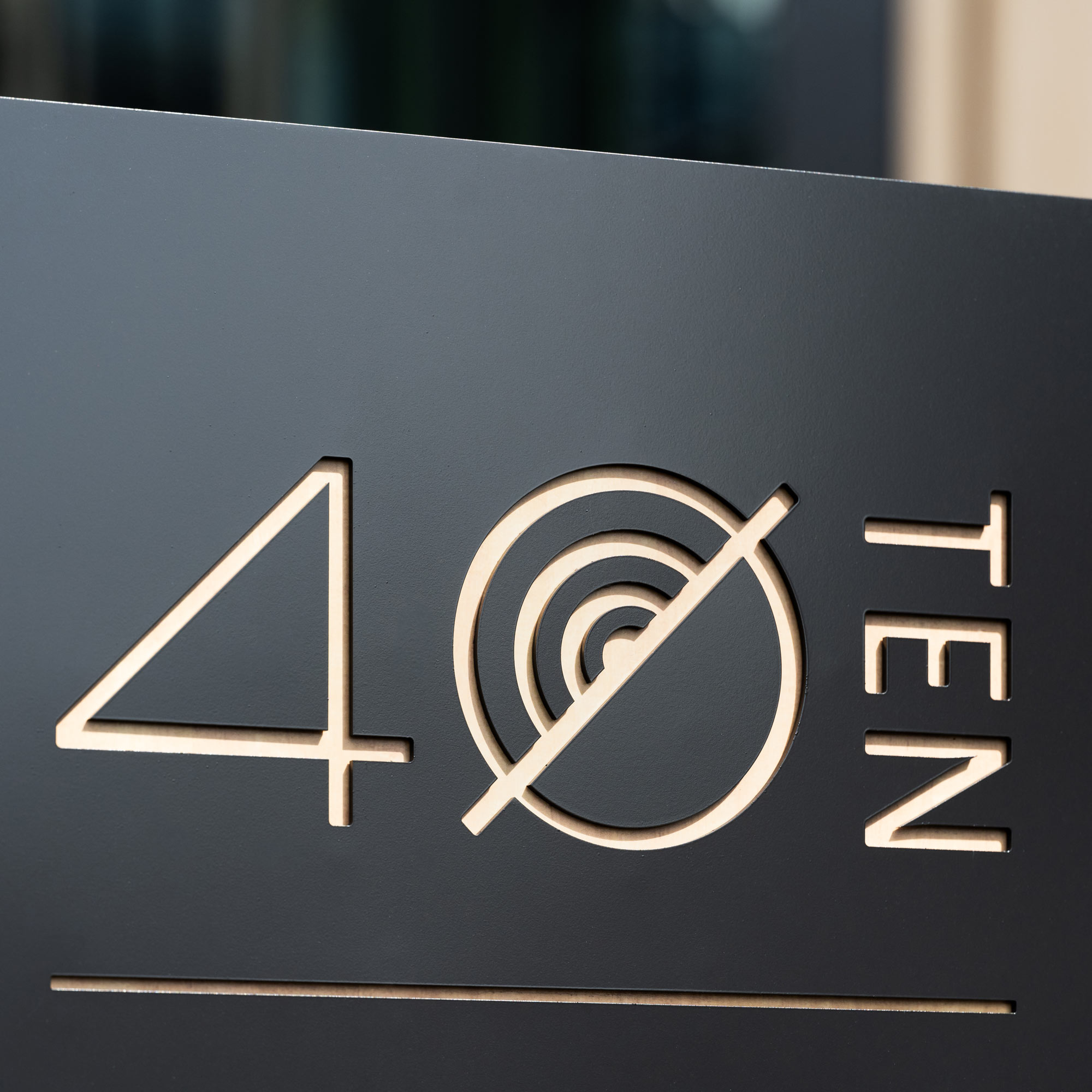
40Ten’s unique construction as a “heavy timber” building, an energy-efficient alternative to steel and concrete structures, allowed for an opportunity to highlight the intrinsic beauty of wood – from exposed grain along the edge of signs, to delicate reveals that let natural textures emerge from within letterforms and glyphs.
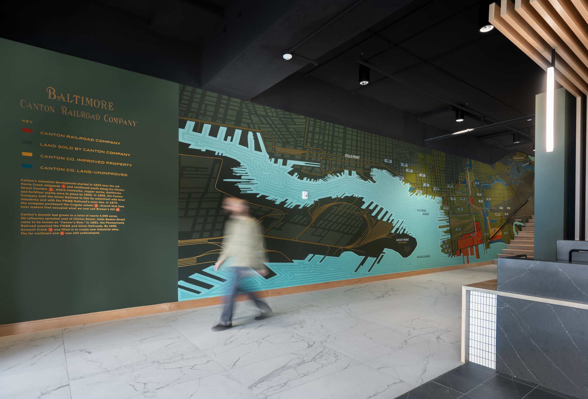
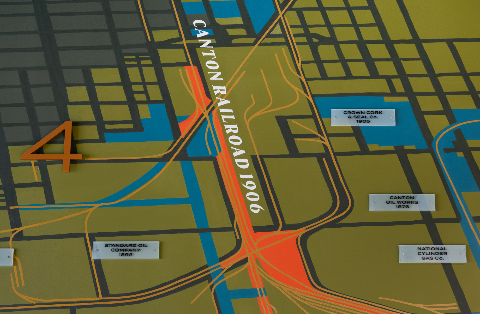
To tell the story of Canton, where 40Ten was built, YDI traced an old map showing Baltimore’s waterfront and railroads, and translated it into a mural for the lobby. Dimensional elements like informational plaques were added on top, to give the whole piece an added presence.
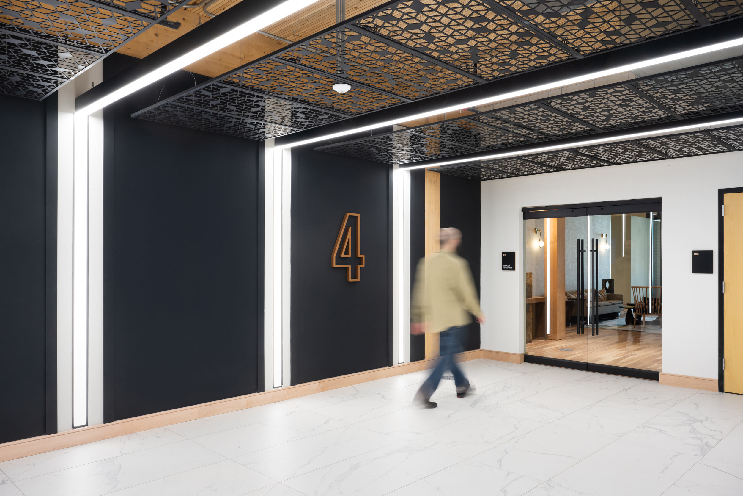
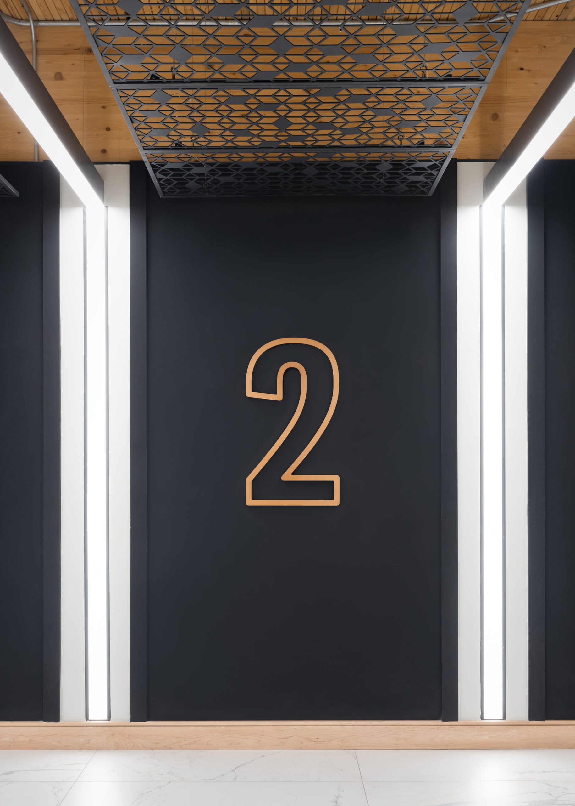
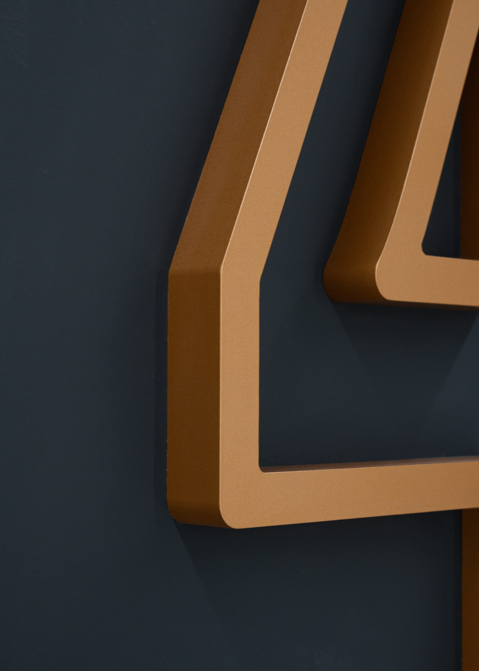
Large, dimensional numbers identify the elevator lobby at each floor. While significant in size, they are understated and refined in design, blending seamlessly into 40Ten’s interiors while simultaneously serving their wayfinding purpose.
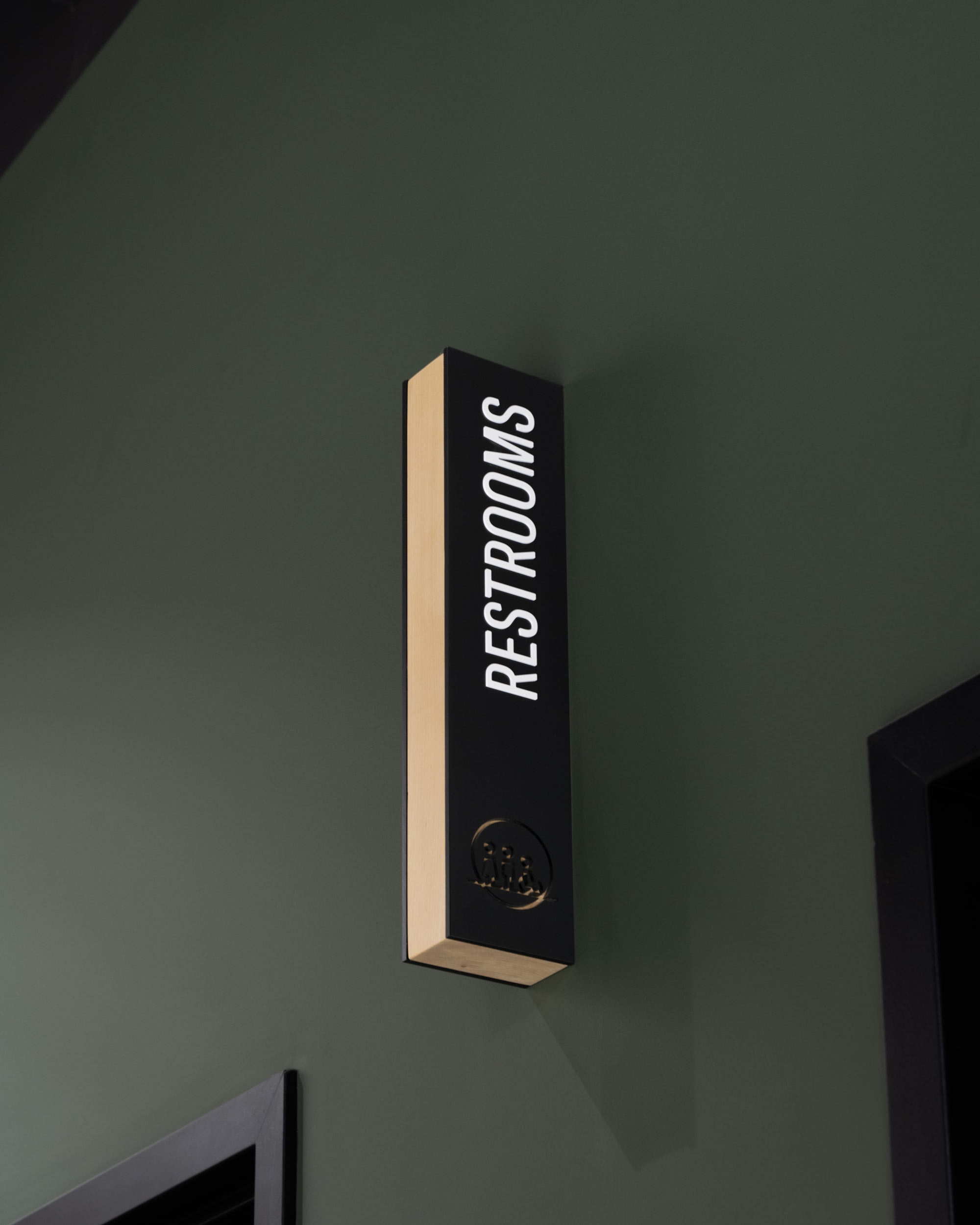
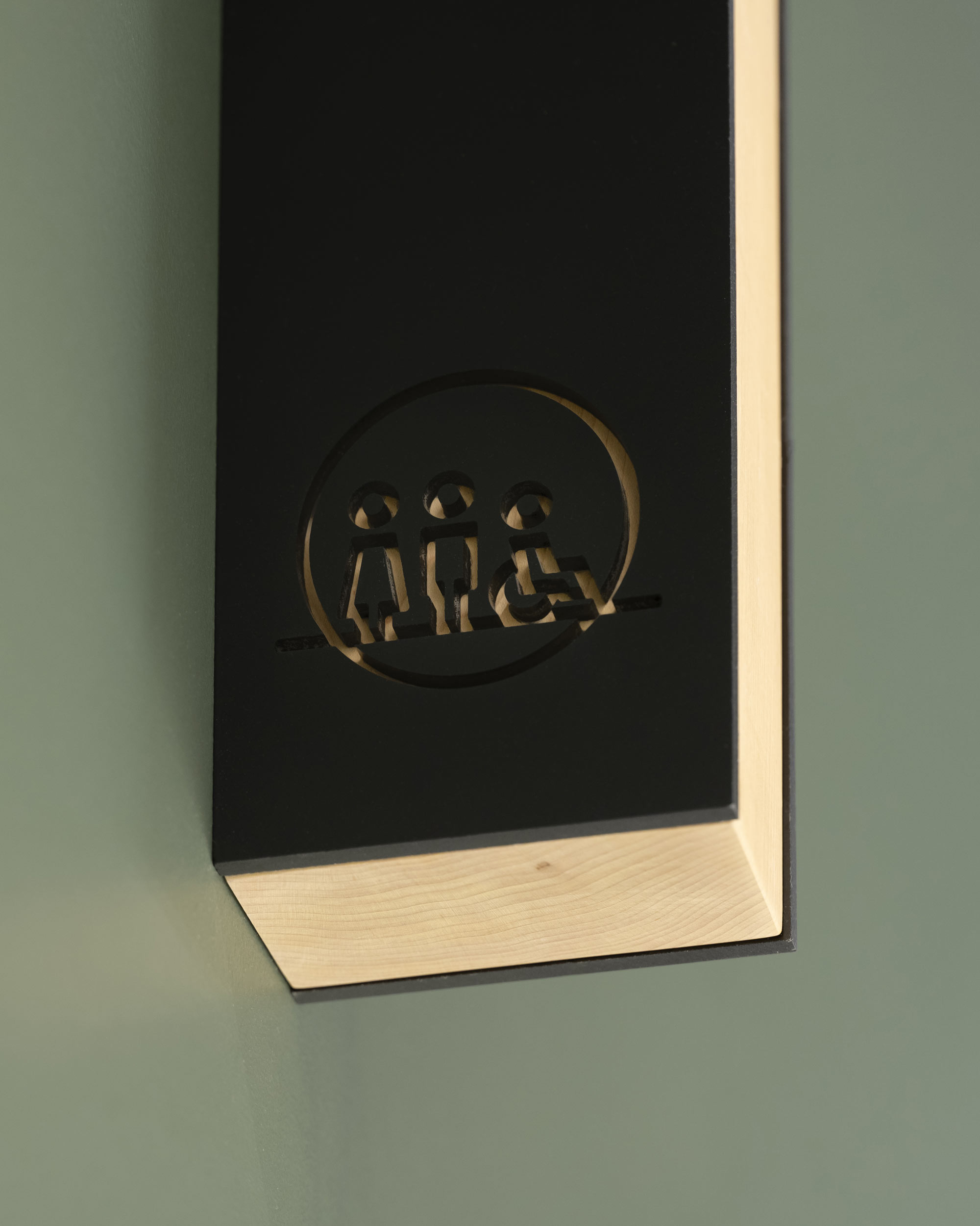
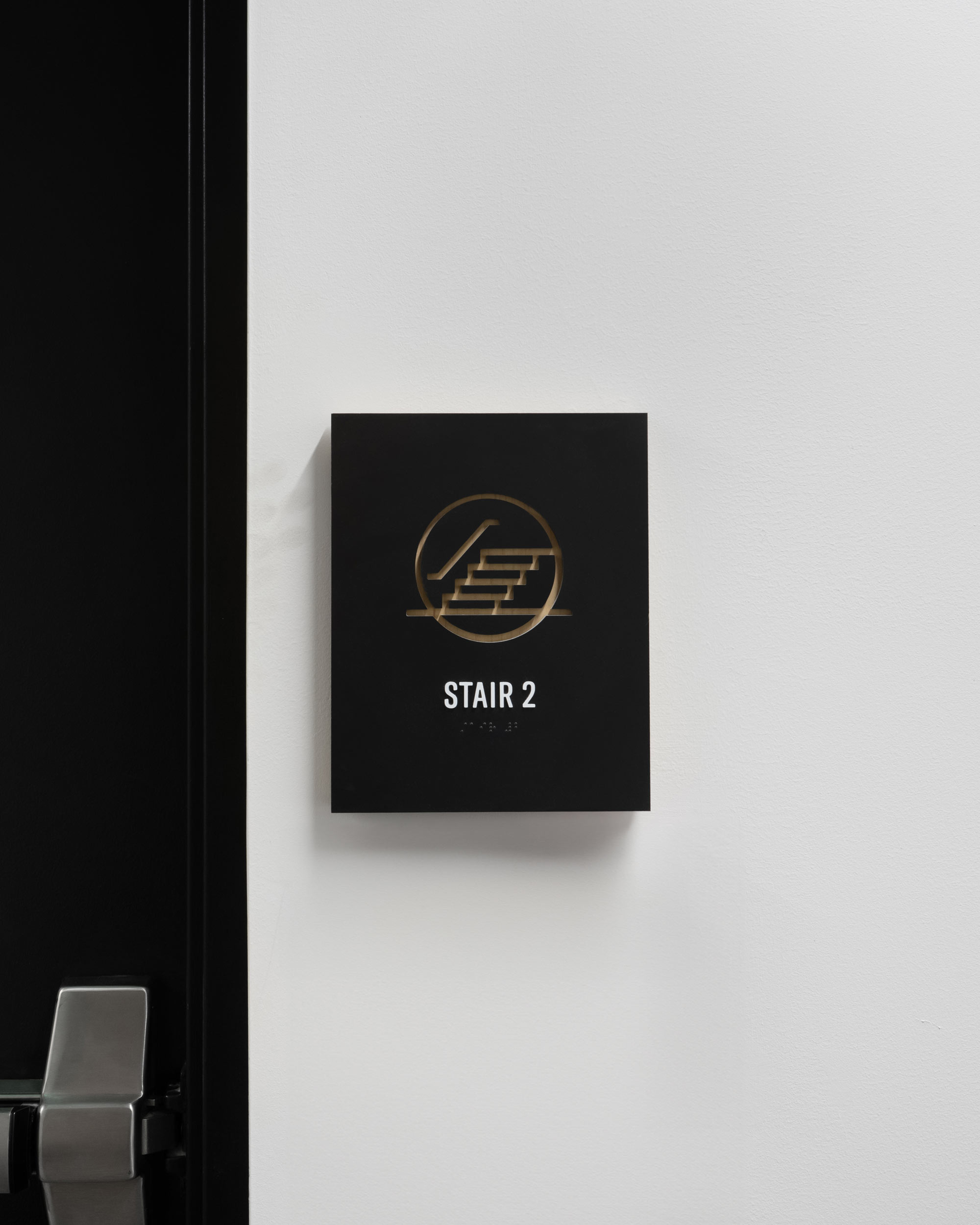
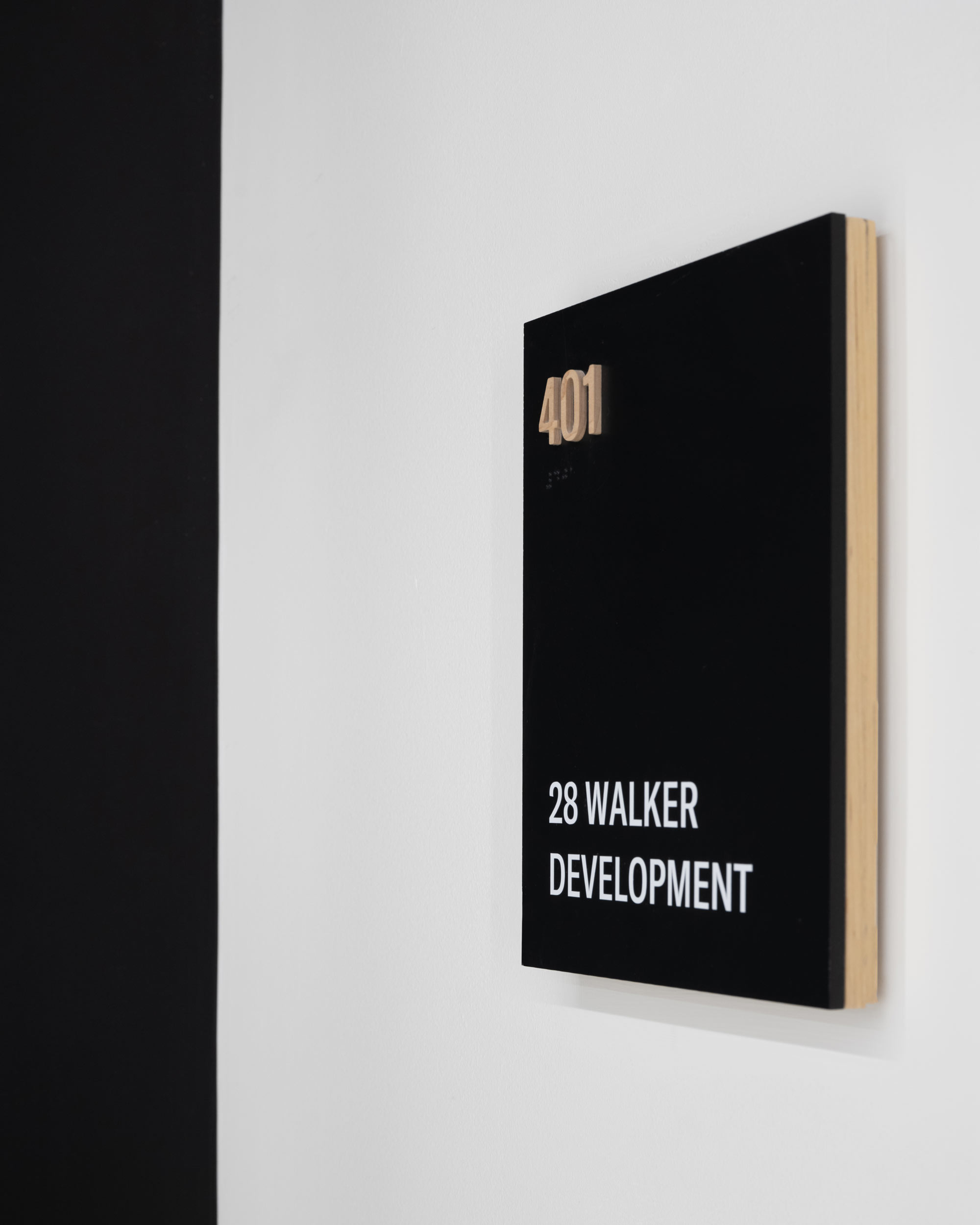
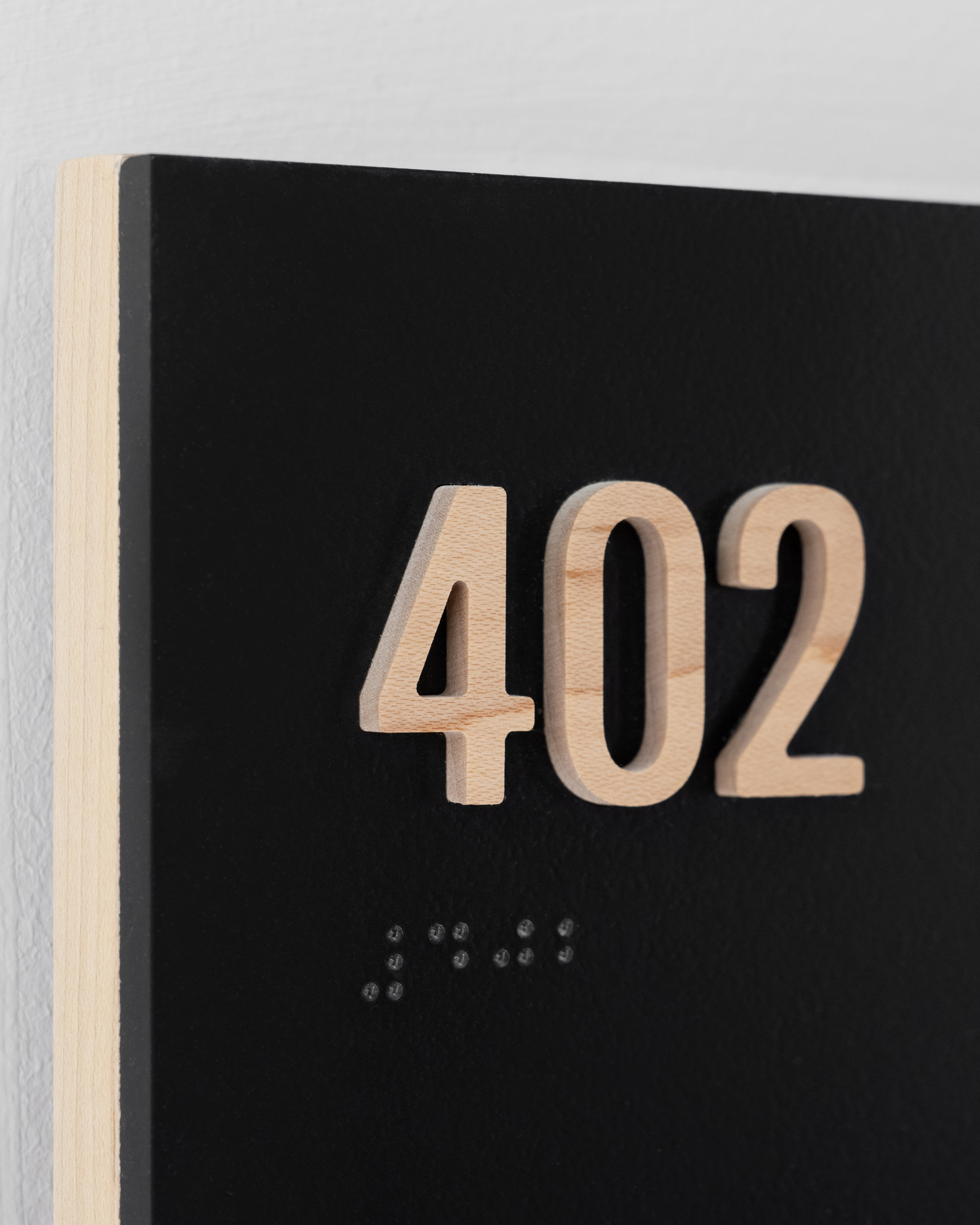
Interior room signs and stairwell identifiers continue the theme of wood and woodgrain. A minimalistic approach to design allows the materials to shine through, highlighting the importance of wood throughout the building.