Copper Union
Completed Date
2022
Industry
Sports / Stadium
Discipline
Brand Design
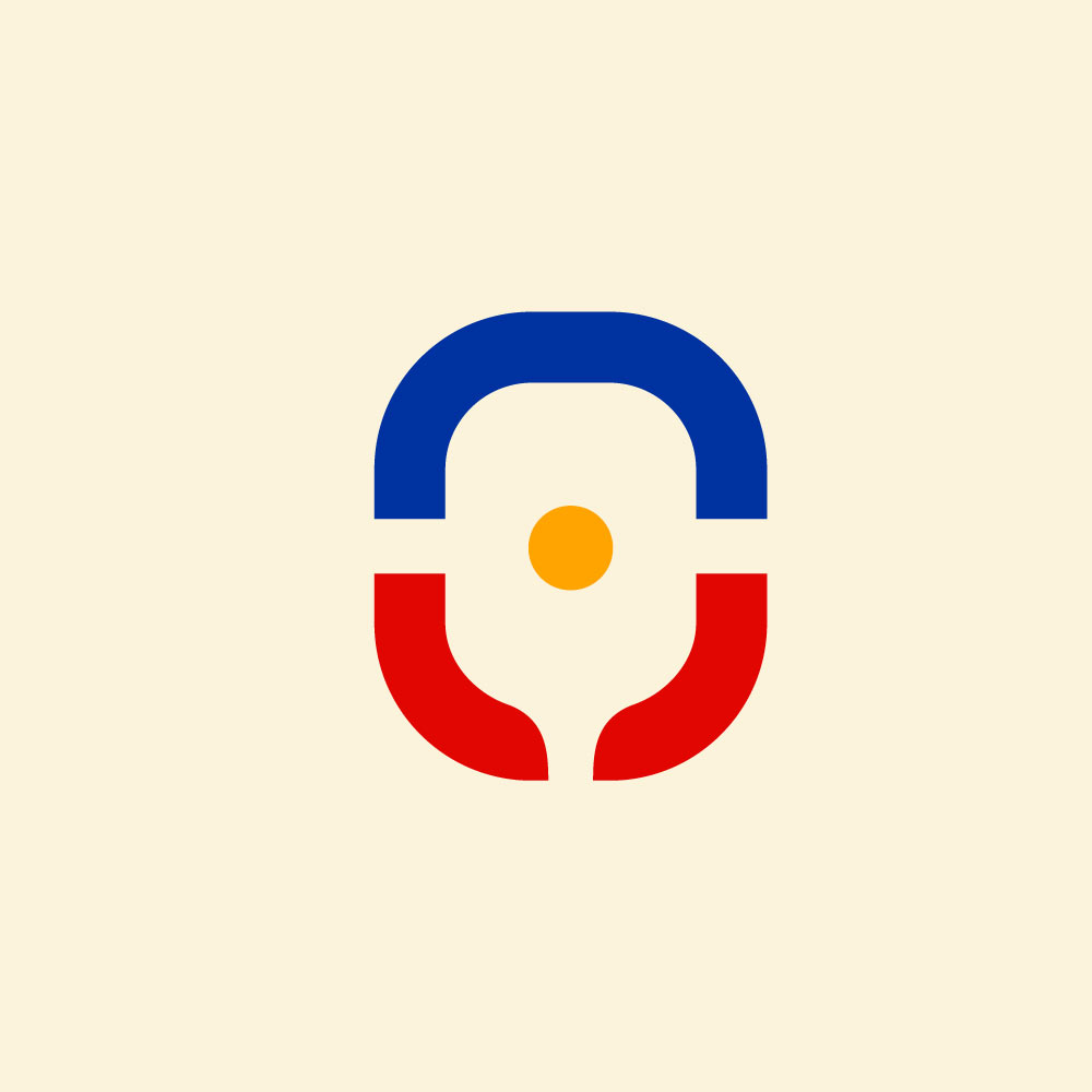
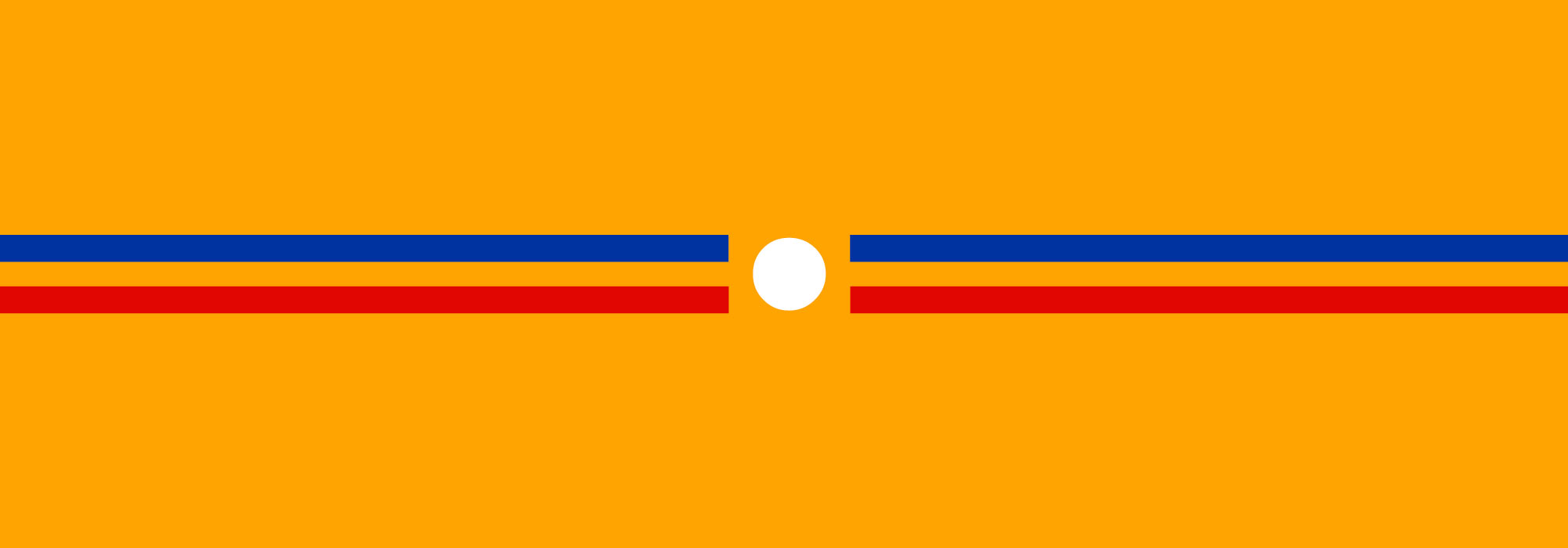
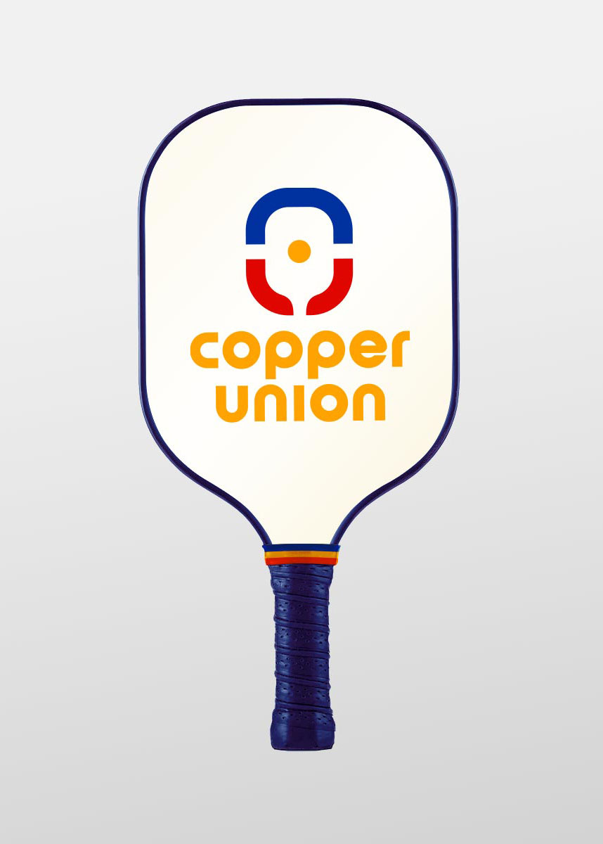
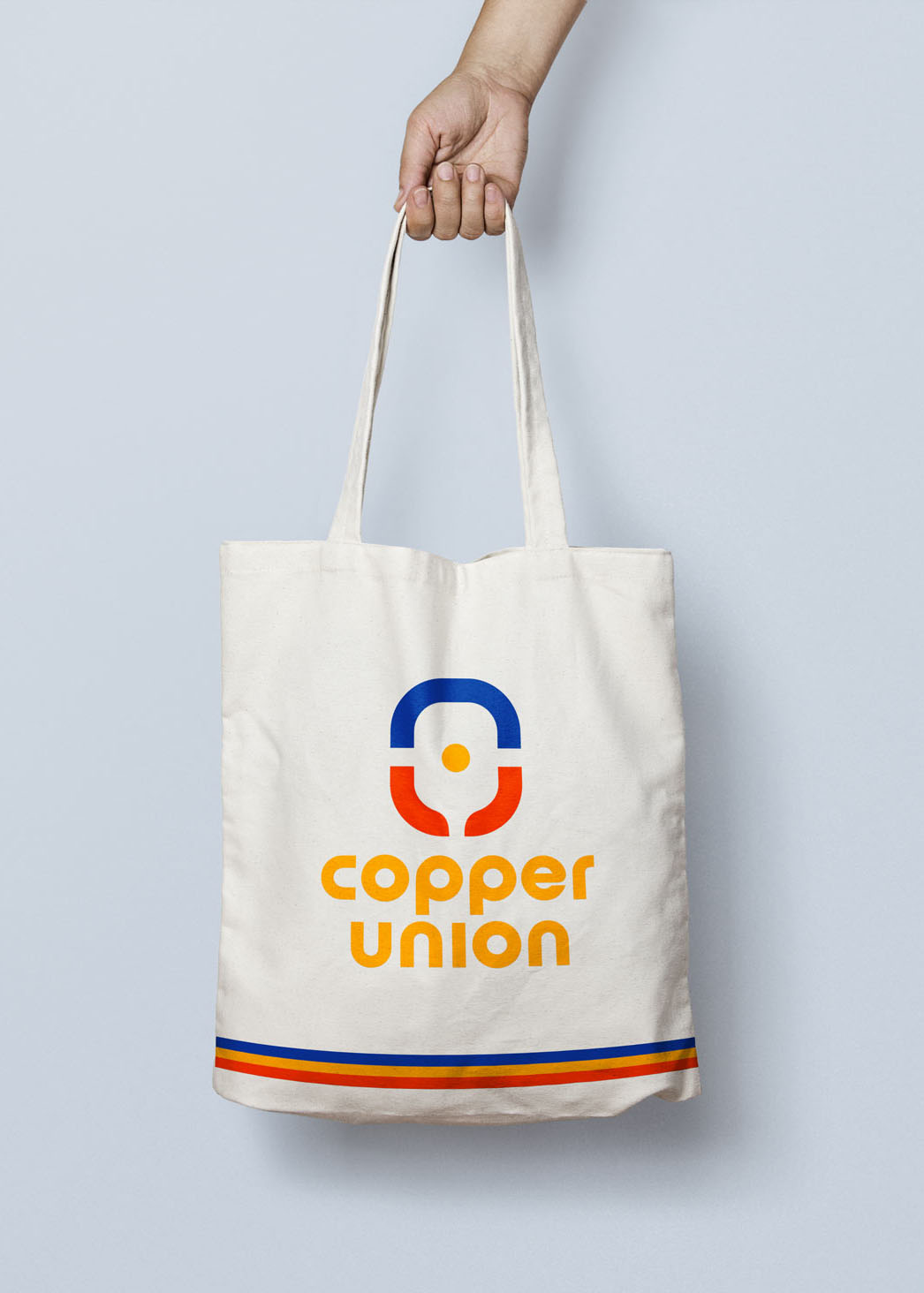
The soft curves of Copper Union’s rounded wordmark pair perfectly with a symbol inspired by the shape of pickleball paddles. And throughout the brand, further elements from the popular game are incorporated into its visual identity, such as court lines and the ball itself. These tricolored lines are also reminiscent of the stripes on athletic tube socks, tying into a 1970s retro aesthetic from a decade when sports like jai alai and ping pong were peaking in popularity.