Frederick Keys
Completed Date
2026
Industry
Sports / Stadium
Discipline
Brand Design
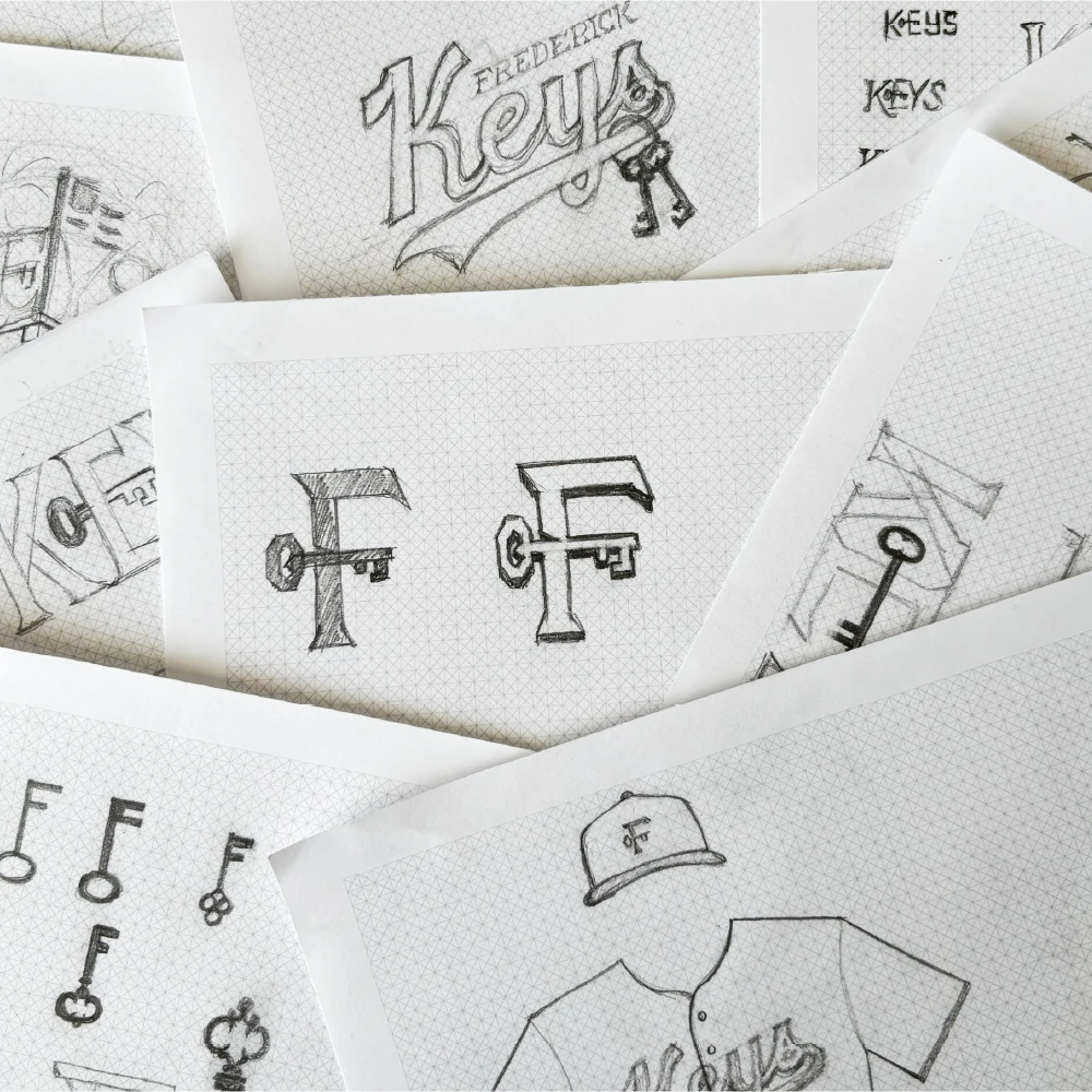
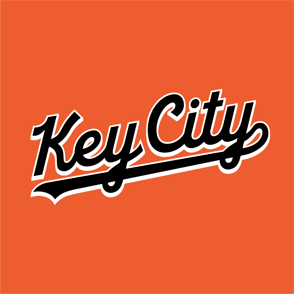
When designing a rebrand for the Frederick Keys, YDI drew from the team’s visual history while introducing keys as a graphic device for the first time. The primary lettermark features angled serifs inspired by the irregular shapes of old skeleton keys and harkens back to turn-of-the-century lettering styles as a subtle nod to historic Frederick.

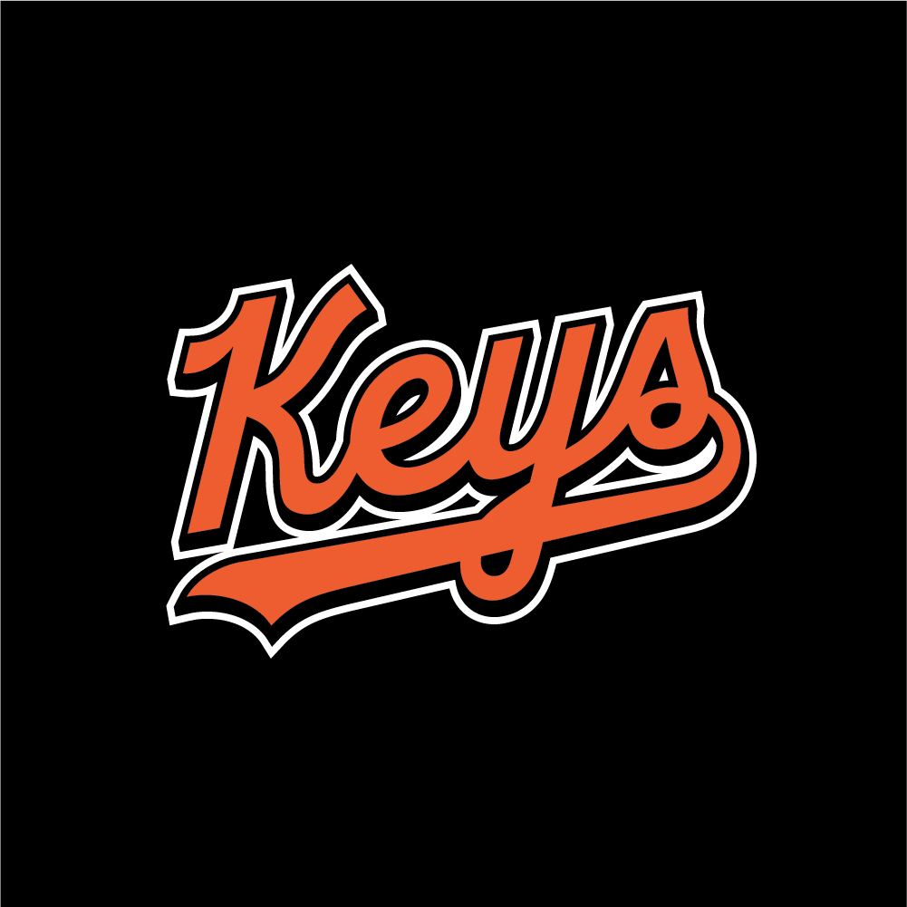
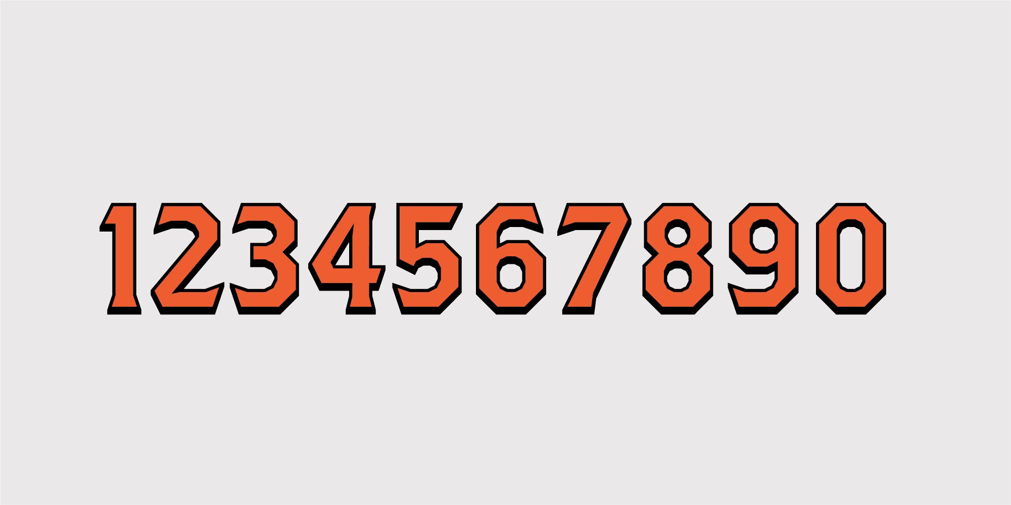
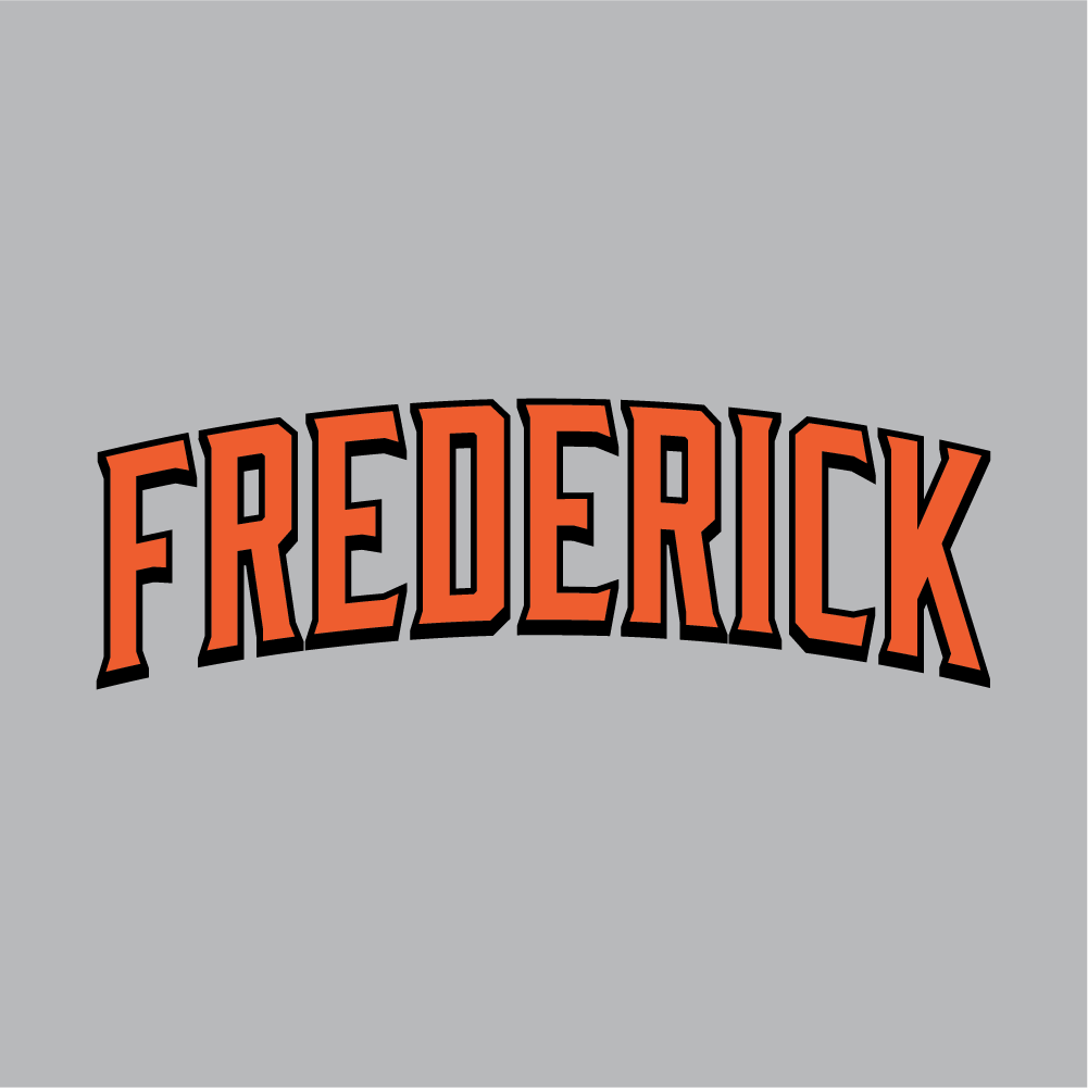
A custom number set and alternate logos round out the rebrand. YDI expanded the Keys’ color palette, a reference to the Baltimore Orioles, with some blue tones that bring a lively look to alternate jerseys and simultaneously tie into American history.
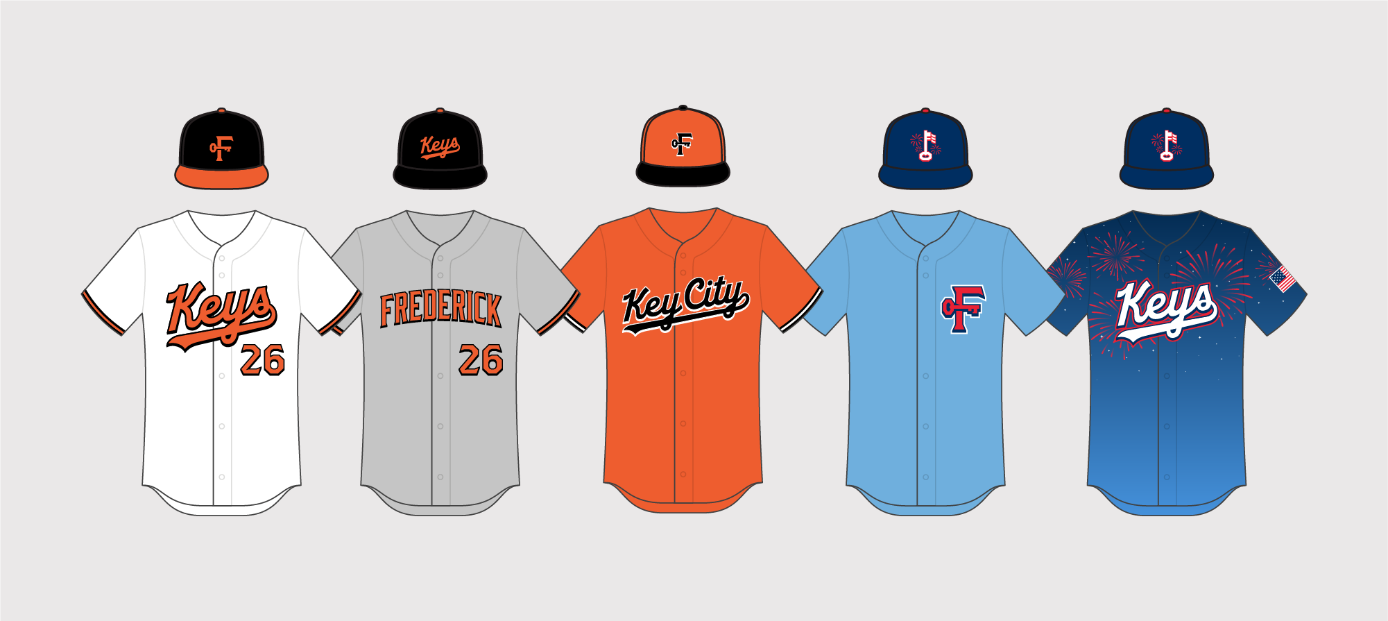


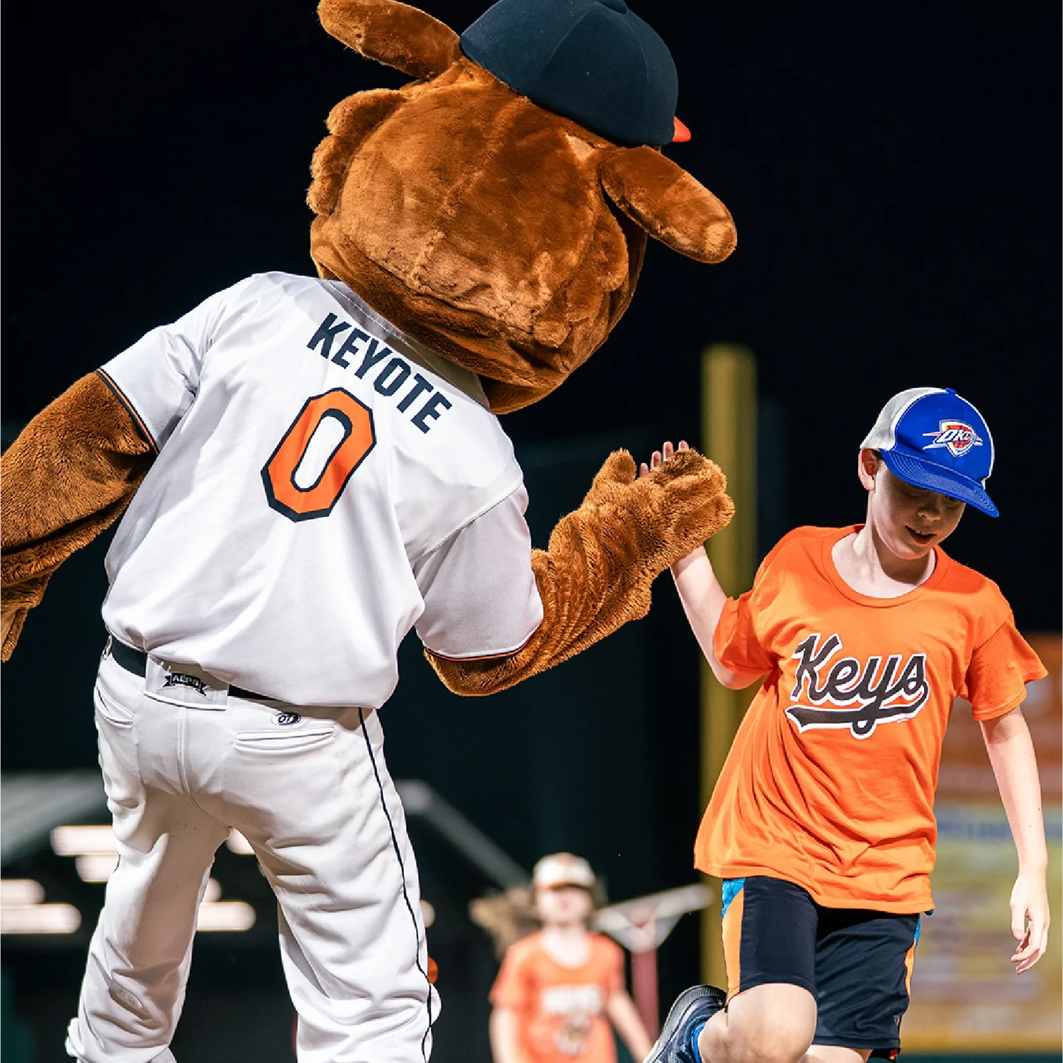
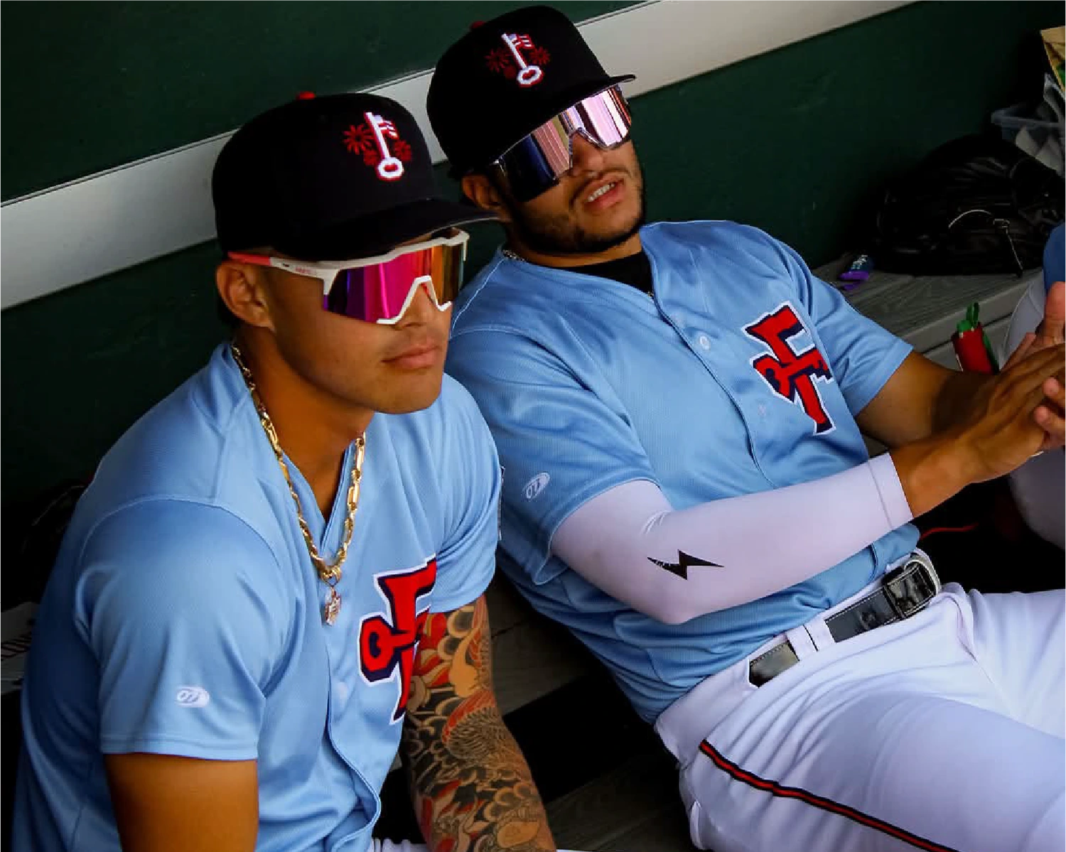
An alternate team logo, and corresponding jersey, allude to the team’s namesake: Francis Scott Key, writer of the Star-Spangled Banner. Bright fireworks dance around a key that also functions as a waving flag and an ‘F’ for Frederick, while an arm patch uses the 15-star flag that inspired the anthem. In addition to team logos and jersey concepts, YDI also created an updated mark for Keyote, the team’s energetic and furry mascot.



Photos:
Frederick Keys
Client:
Attain Sports