Revival
Completed Date
2018
Industry
Hospitality
Discipline
Experiential DesignBrand Design
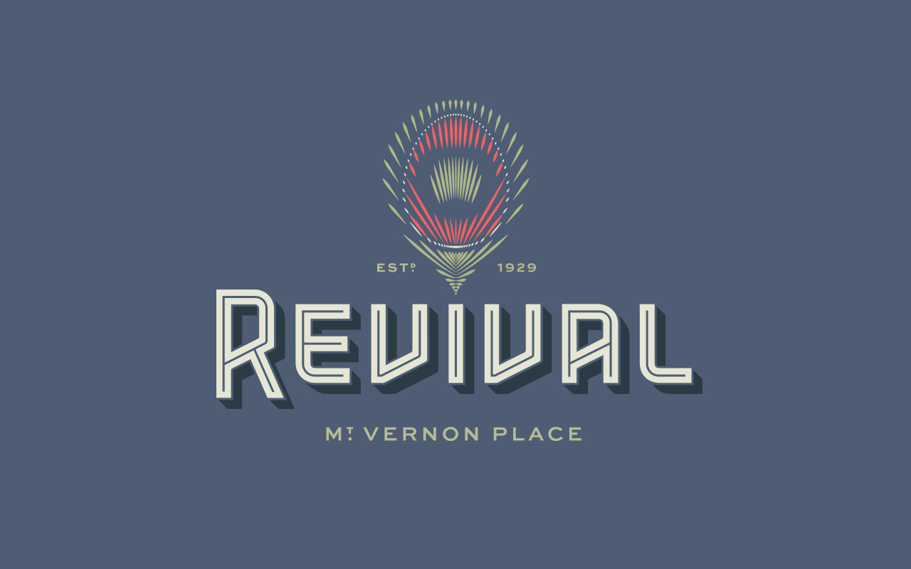
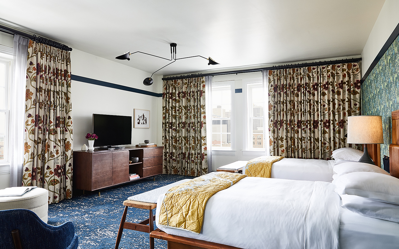
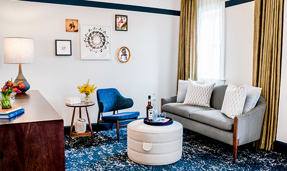
At the intersection of culture, creativity, and community stands Revival, a gathering place for travelers with soul. The design references a storied past and weaves the old and the new together throughout the guest experience. YDI was tasked with branding the hotel Revival, its rooftop bar and restaurant Topside, its basement karaoke restaurant B-side, and its casual cafe Square Meal. As a celebration of art, cuisine, craftsmanship, and local history, Revival provides a profoundly warm welcome to Charm City.
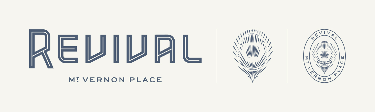
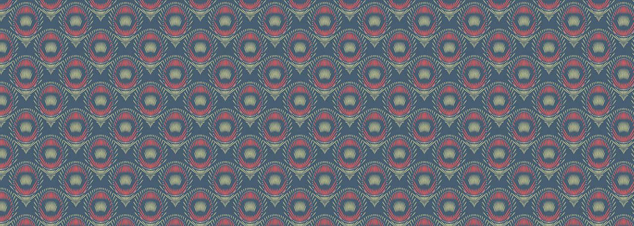
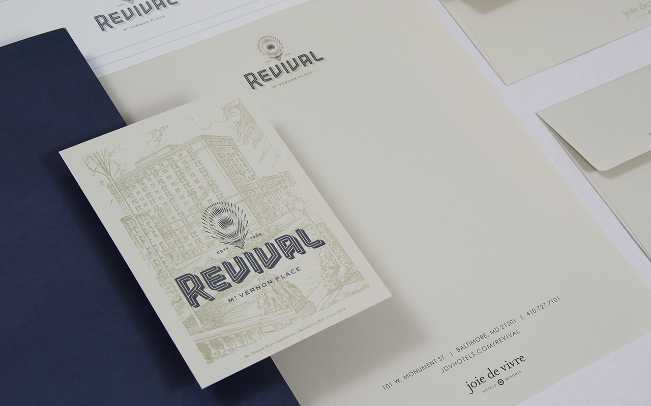
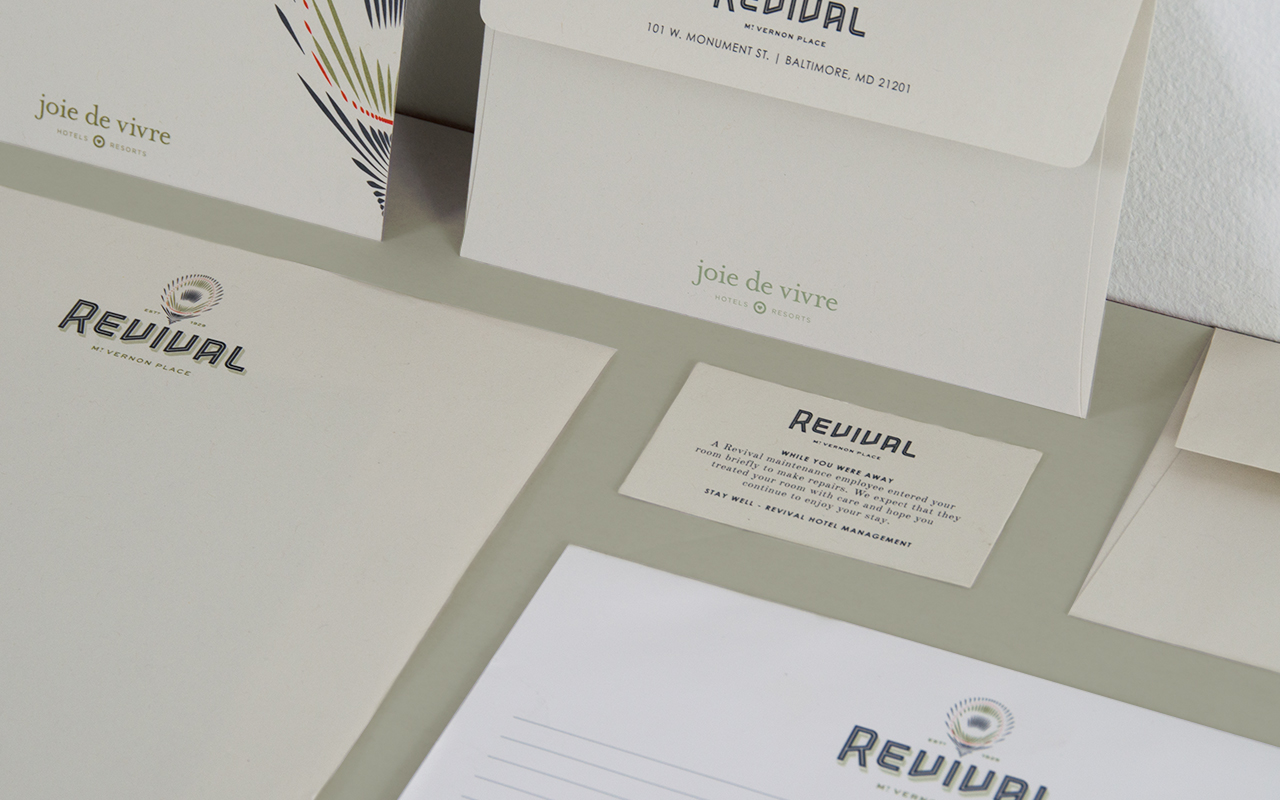
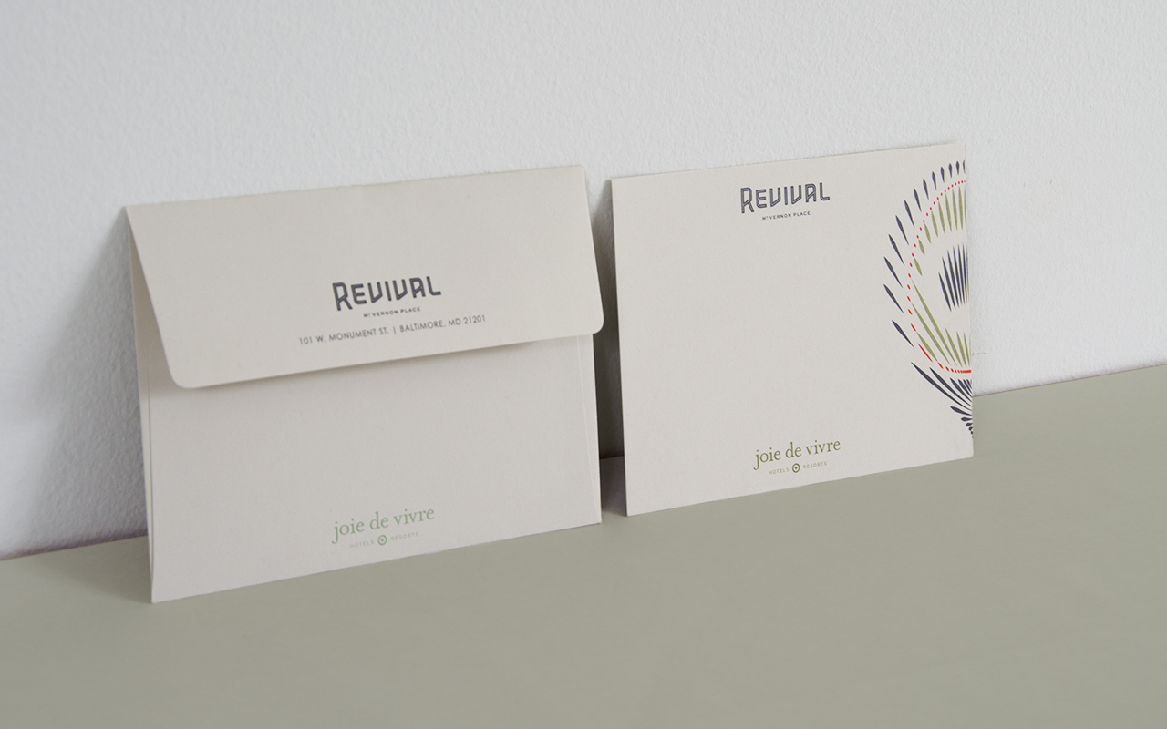
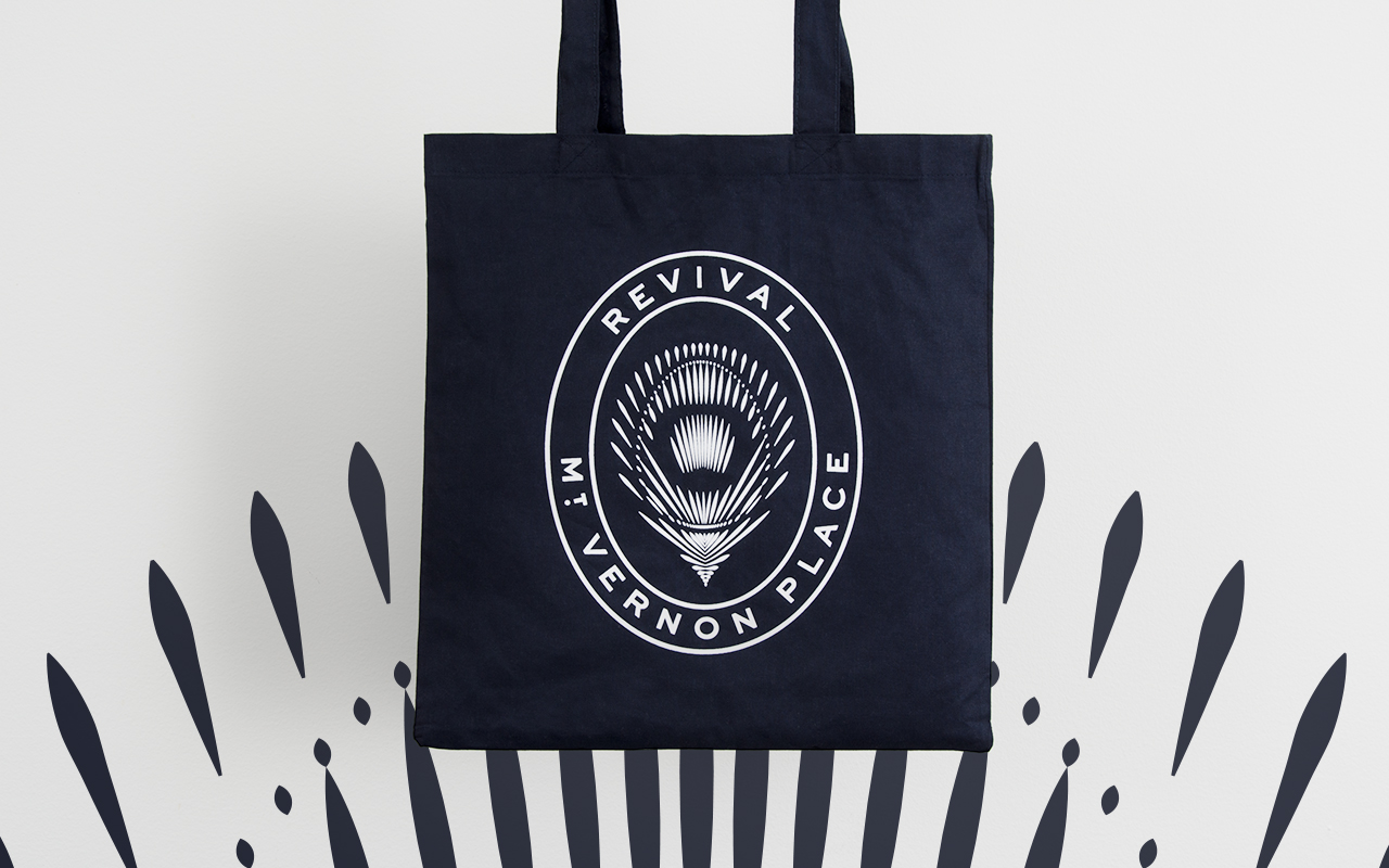
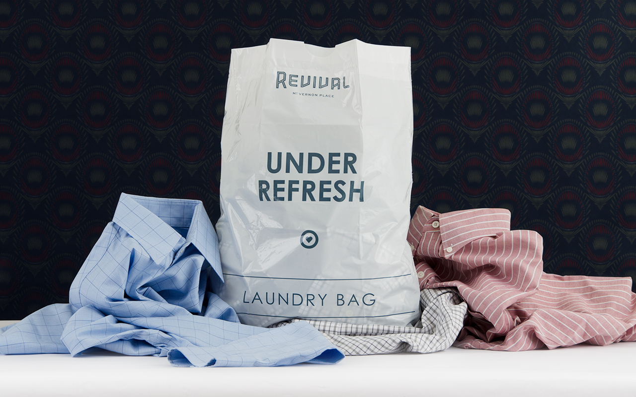
YDI was first tasked with developing the hotel name and brand to match the vision of the nuovoRE team. The name Revival references the renovation of the 1929 building, the new restaurants it houses, and the elevation of the local community and its neighborhood. The signature peacock feather emblem communicates a playful elegance representative of the hotel’s ambiance. YDI also had a hand in guiding the brand’s written voice and character which is evident in the environmental graphics and collateral pieces.
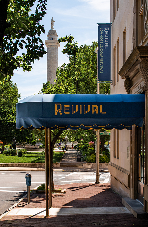
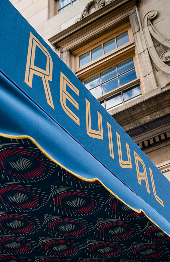
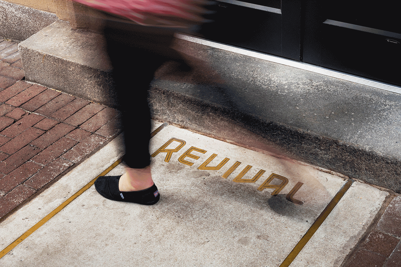
The entrance to the hotel is marked by a canopy with the Revival logo on the exterior and the peacock feather pattern on the underside. The concrete walkway is inlaid with a bronzed metal rendering of the Revival logo.
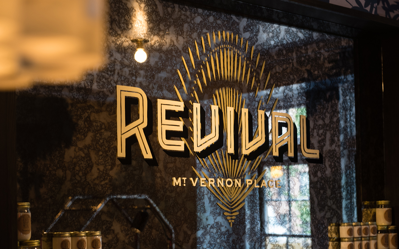
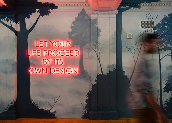
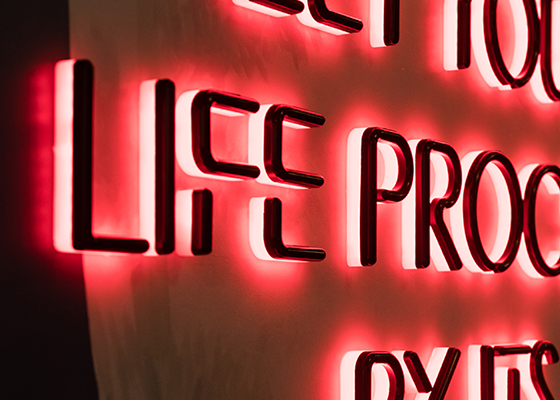
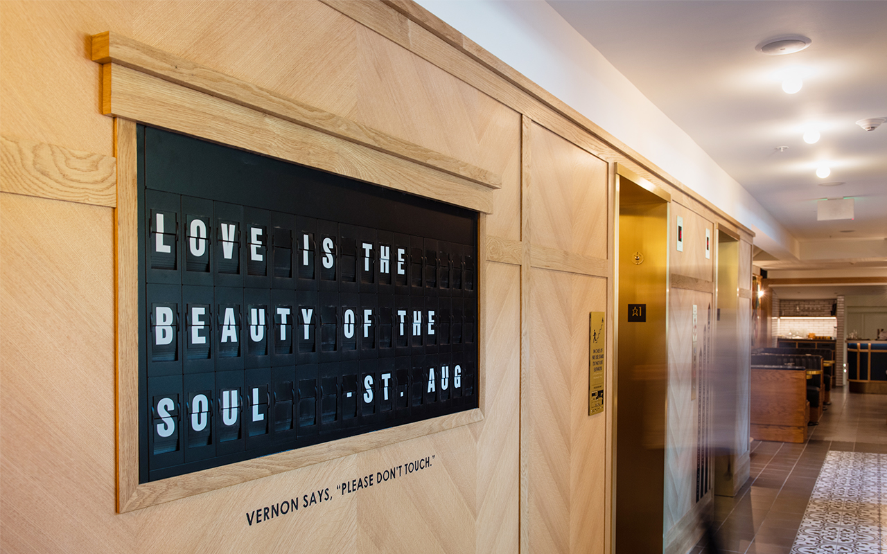
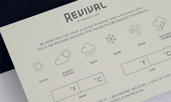
YDI’s most difficult challenge was to create functional designs that complimented the interior space while at the same adding a layer of curiosity and discovery. The hand-painted logo over an aged mirror greets guests at reception while a neon sign adds a dash of modern novelty. The split flap sign in the lobby (that we aptly named “Vernon”) has an old-school look that is embedded with new technology and can display anything from live weather updates to custom messages and fun phrases chosen by the hotel staff.
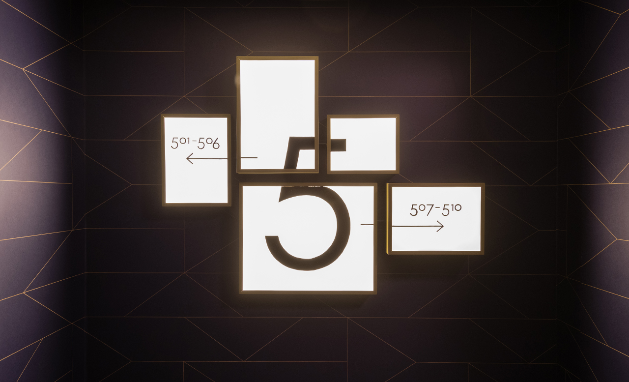
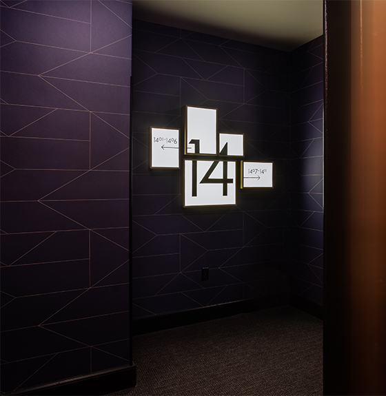
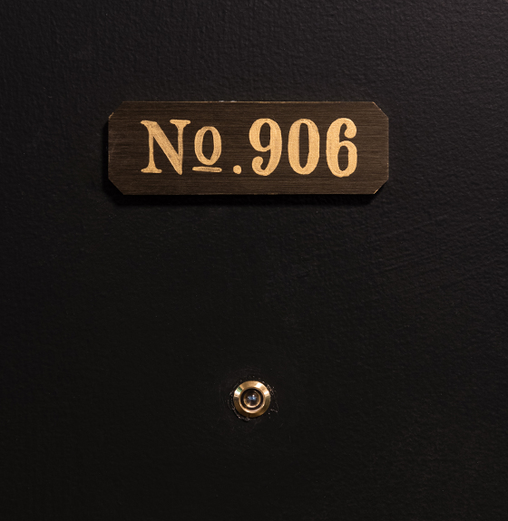
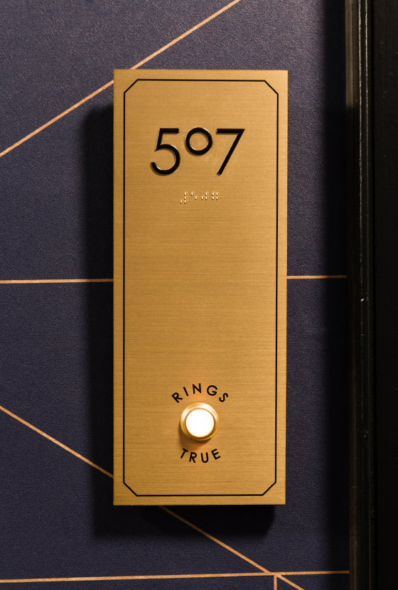
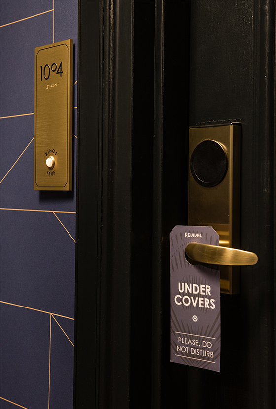
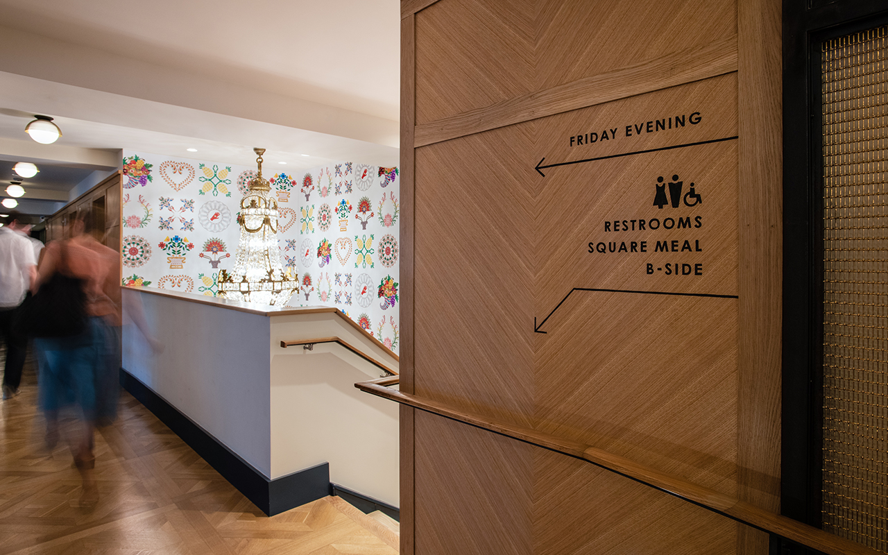
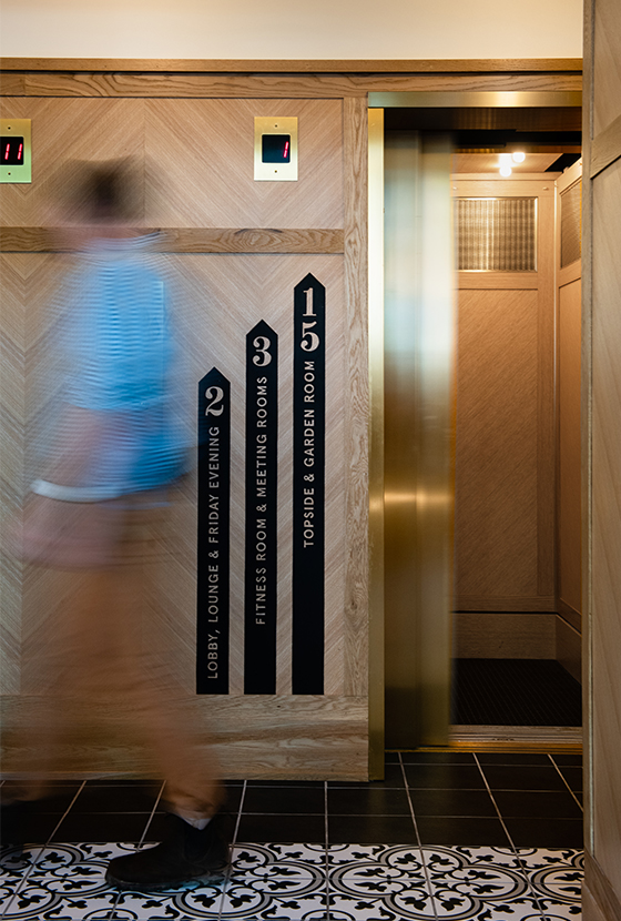
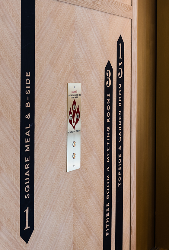
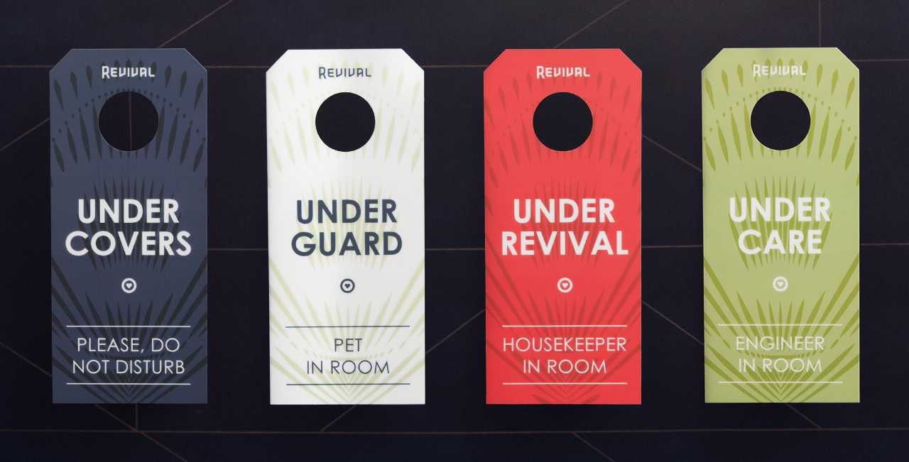
YDI had fun identifying creative solutions for wayfinding throughout the hotel. Each room number is marked with a bronze-colored faceplate that includes a doorbell. Custom designed light box clusters with hand painted graphics serve as floor markers. Each set identifies the floor, directs to individual rooms, illuminates the elevator landing, and gives the feel of a salon style art wall. The elevator banks have bold directional arrows with both floor numbers and descriptive text on them while the staircase uses a more minimal arrowed approach.
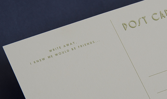
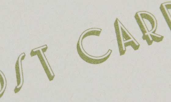
The brand collateral is unified by off-white stock from French Paper Company and simple typography, while the bold use of the peacock feather gives it an elegant flair. One piece we especially enjoyed working on is the postcard that utilizes an illustration we found in archival materials for the original Mt. Vernon Place Apartments.
Sign Fabrication:
Mural Artist: