Cross Street Market
Completed Date
2019
Industry
Hospitality
Discipline
Website DesignExperiential DesignBrand Design
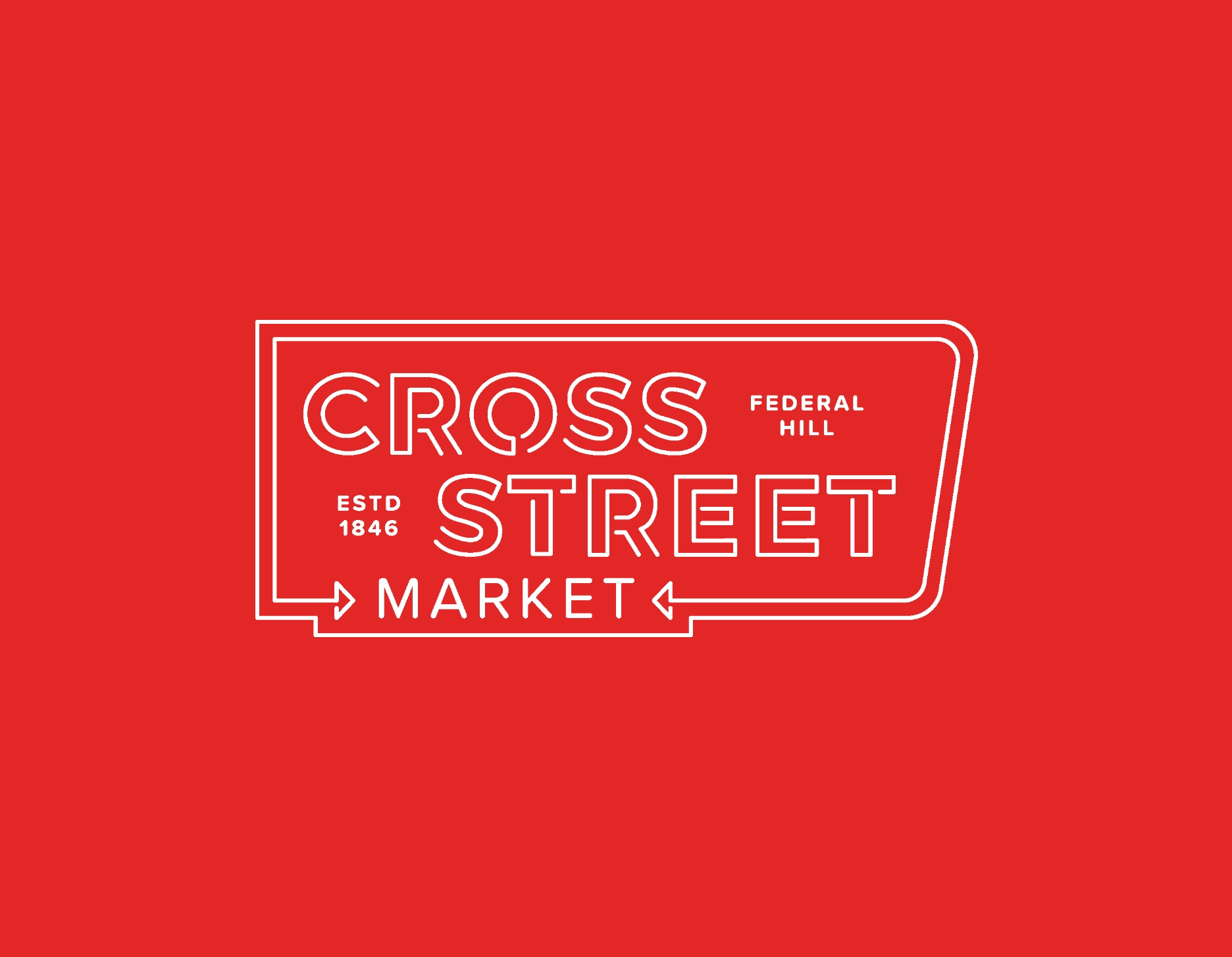
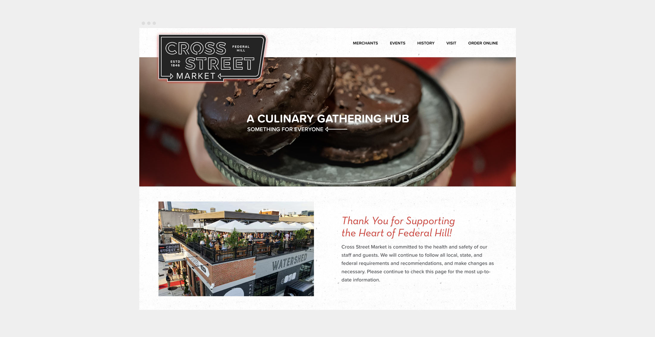
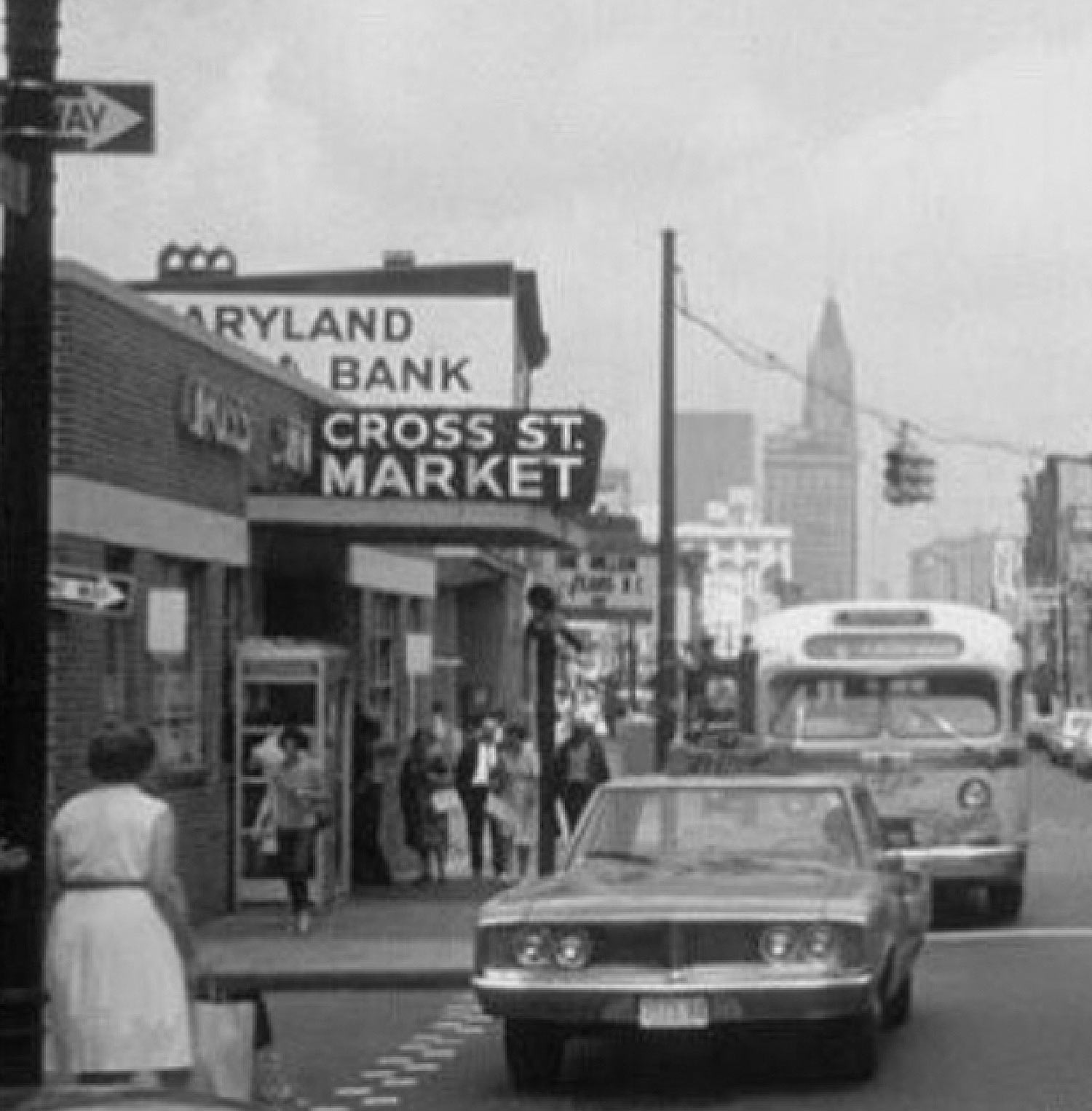
Cross Street Market’s brand identity reflects the original building’s 1950s appearance and pays homage to the historic blade sign whose outline once again stands boldly on the canopy of the market’s main entrance. New logos and signage implement a custom neon type outline, with a timeless look that is synonymous with this Federal Hill staple.
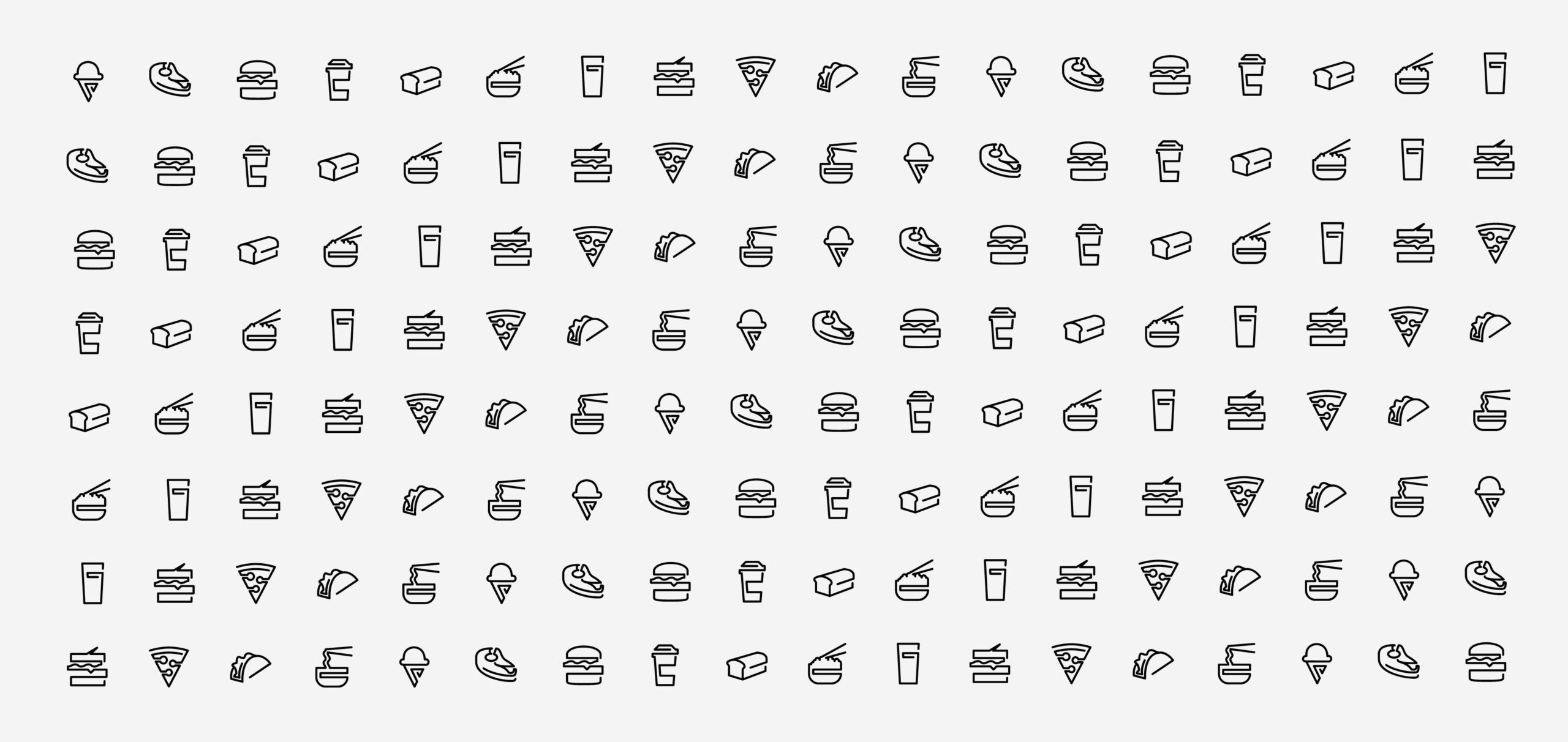
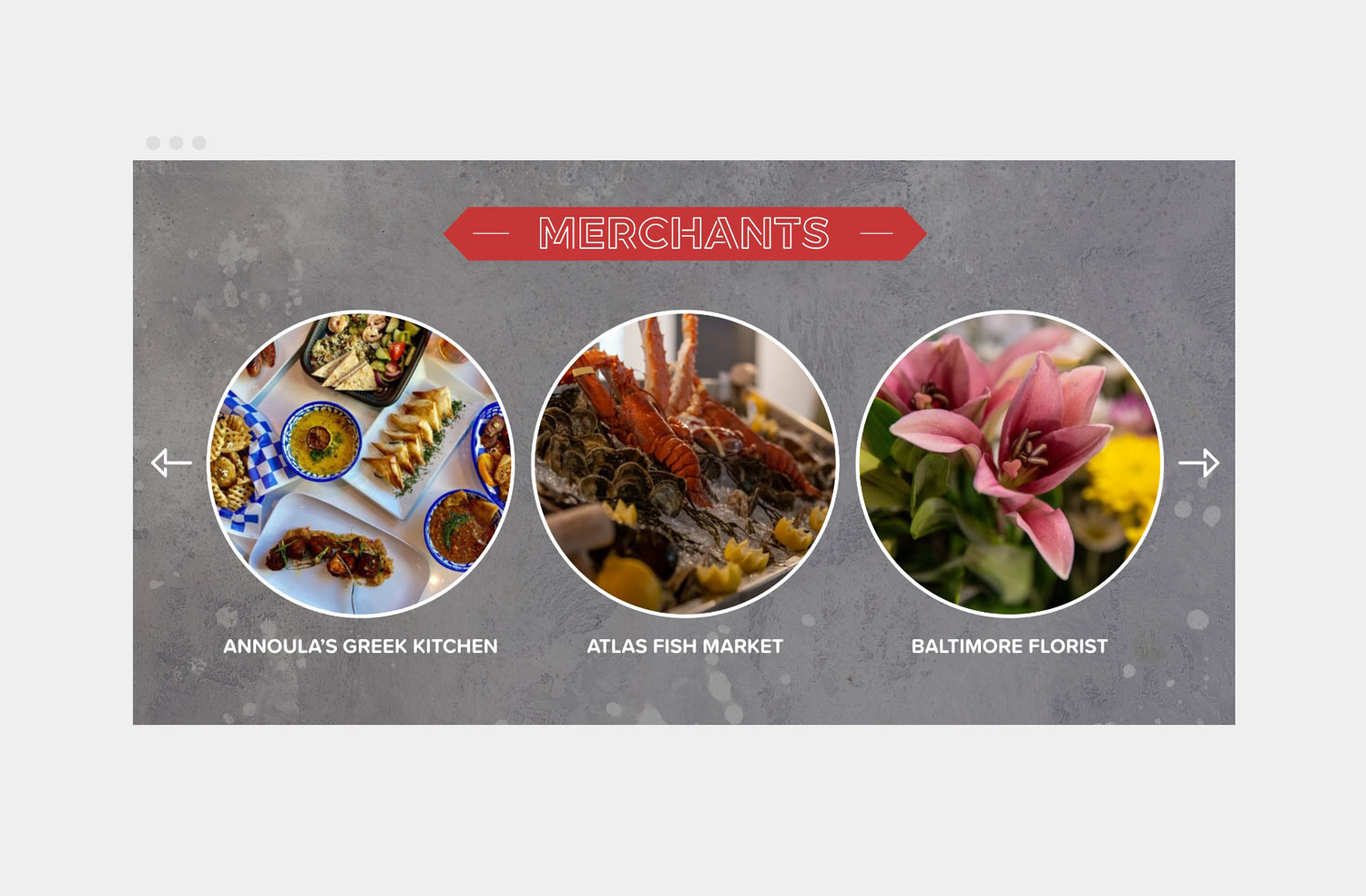
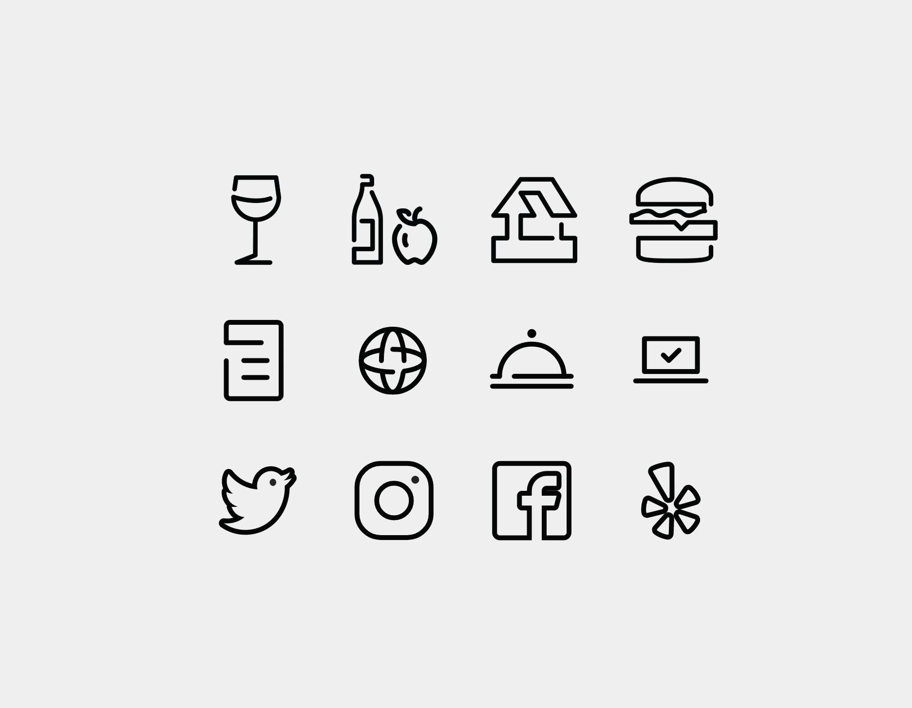
In keeping with the neon outlines of Cross Street Market’s primary mark, a bevy of food icons were designed in a similar style to use across printed and digital marketing.
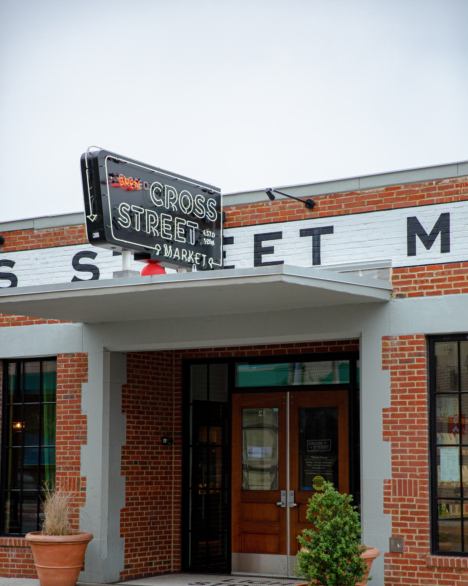
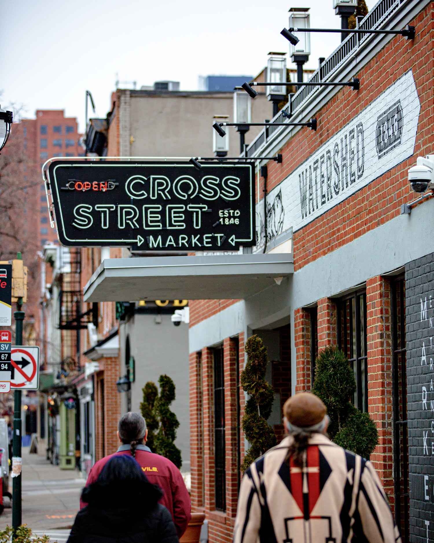
The iconic shape of Cross Street Market’s blade sign revives the design that graced the building in the 1950s, and includes artisanal details such as authentic neon lettering to complete the period-correct look. An “OPEN/CLOSED” designation can be switched depending on the time of day, while a playful arrow leads along the outer edge of the sign to point toward the market’s entrance.
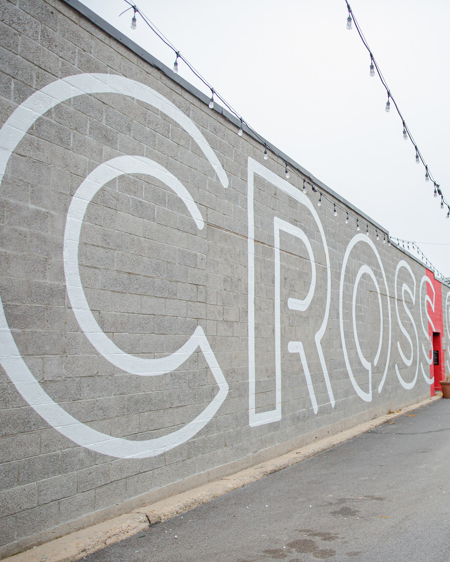
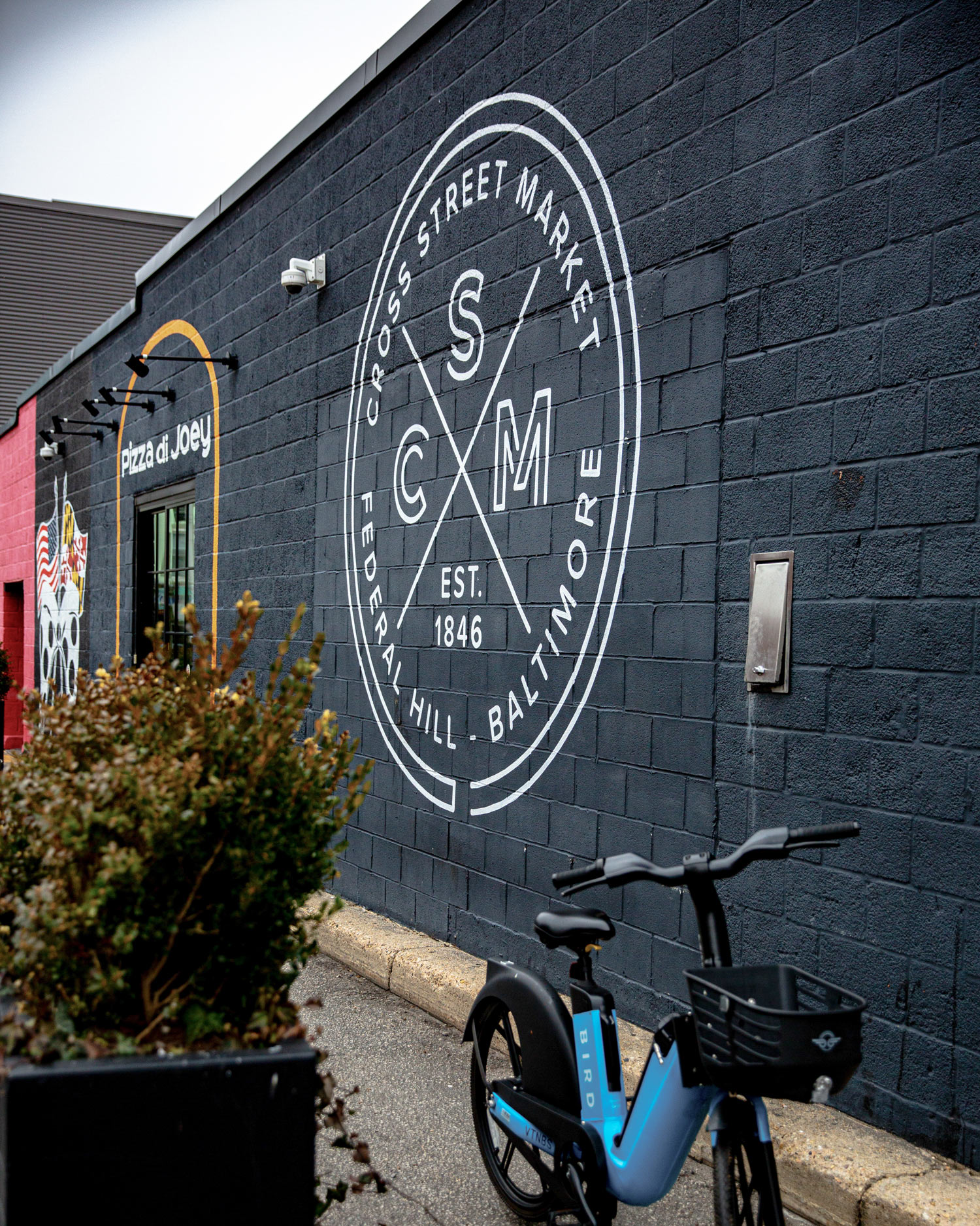
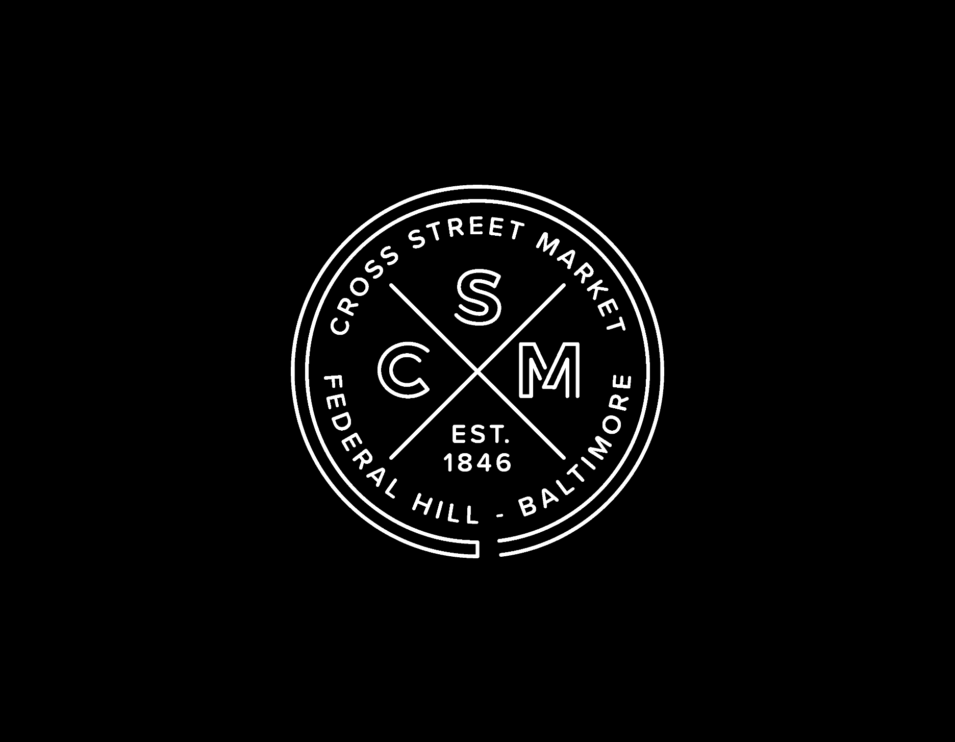
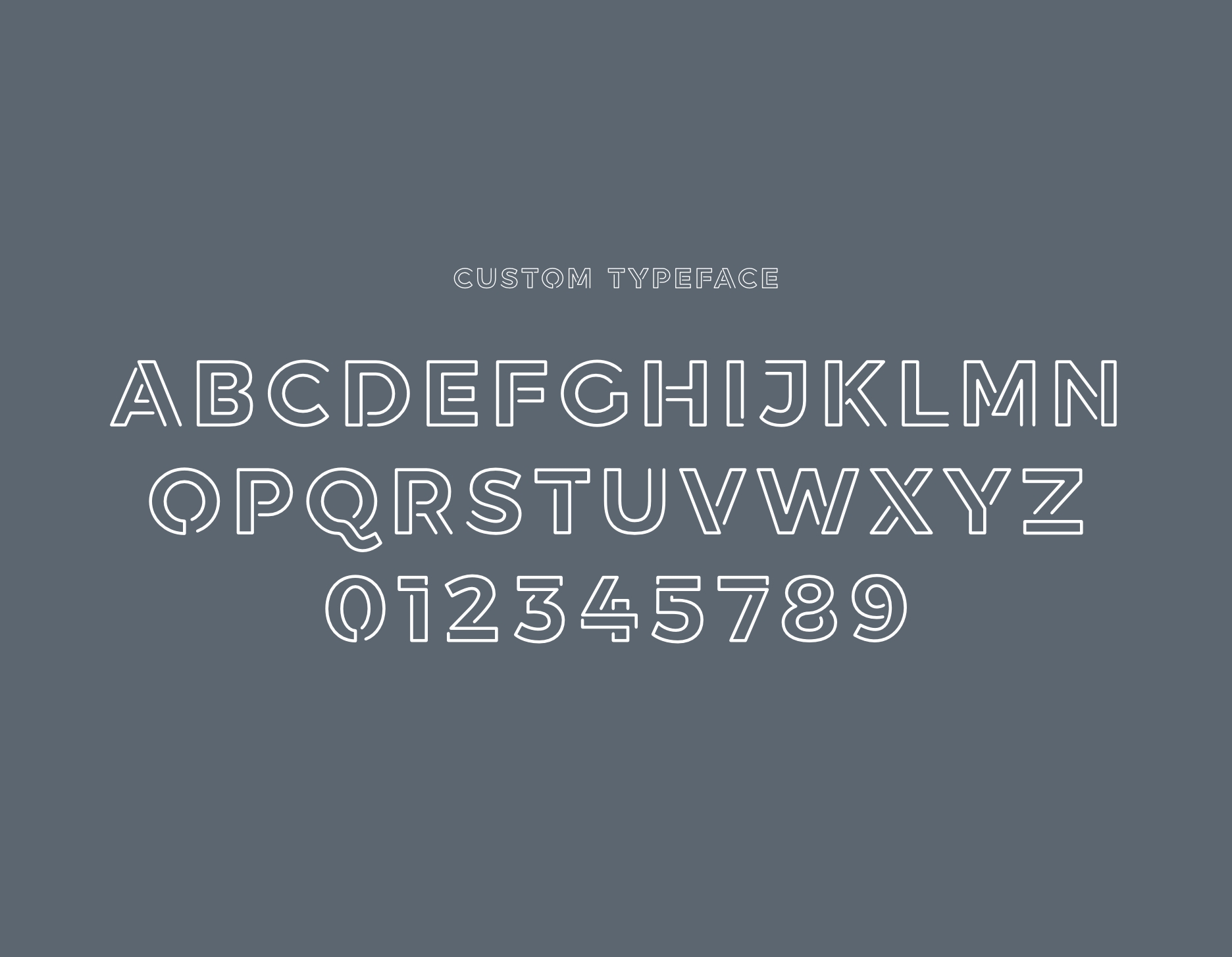
The circular badge that forms Cross Street Market’s secondary identity was the perfect candidate for a mural treatment on one side of the building. On another side, the market’s name was painted large-scale in the custom outline font that YDI designed for the project.
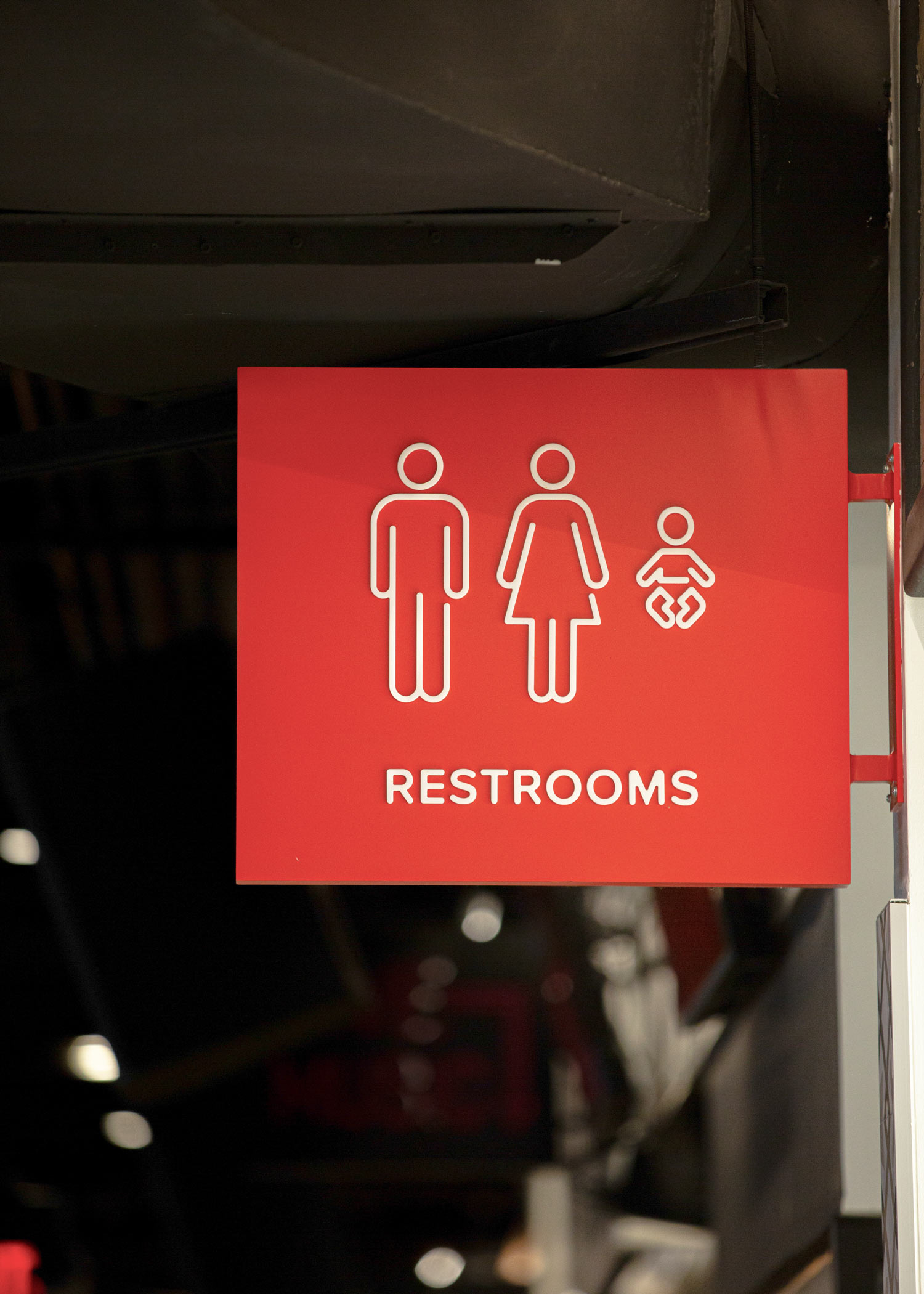
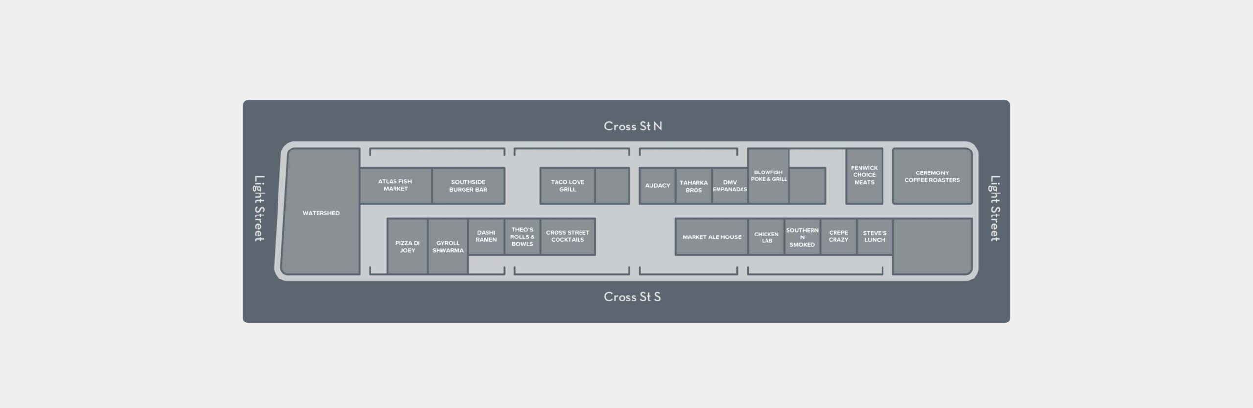
Signage at Cross Street Market uses the same neon outline style as its playful food icons. Similarly, social media icons were redrawn to match this aesthetic for a cohesive look throughout both physical and digital spaces. YDI also drew up a map of the vendor stalls that give Cross Street Market its local flavor.
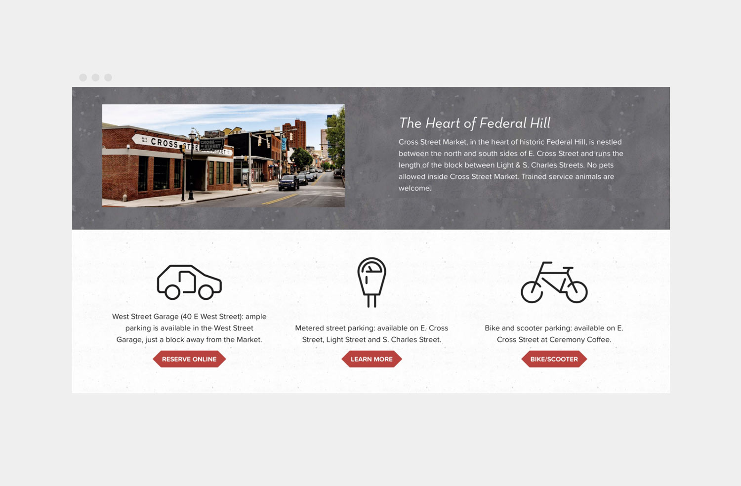
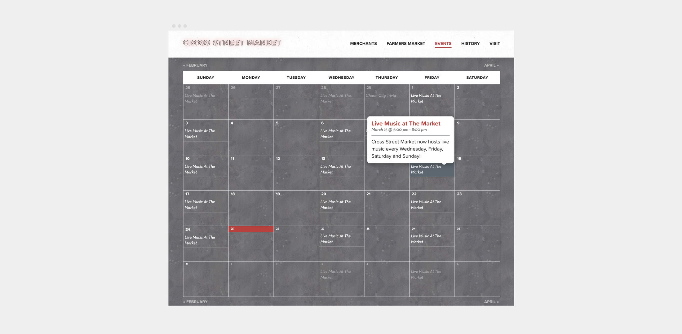
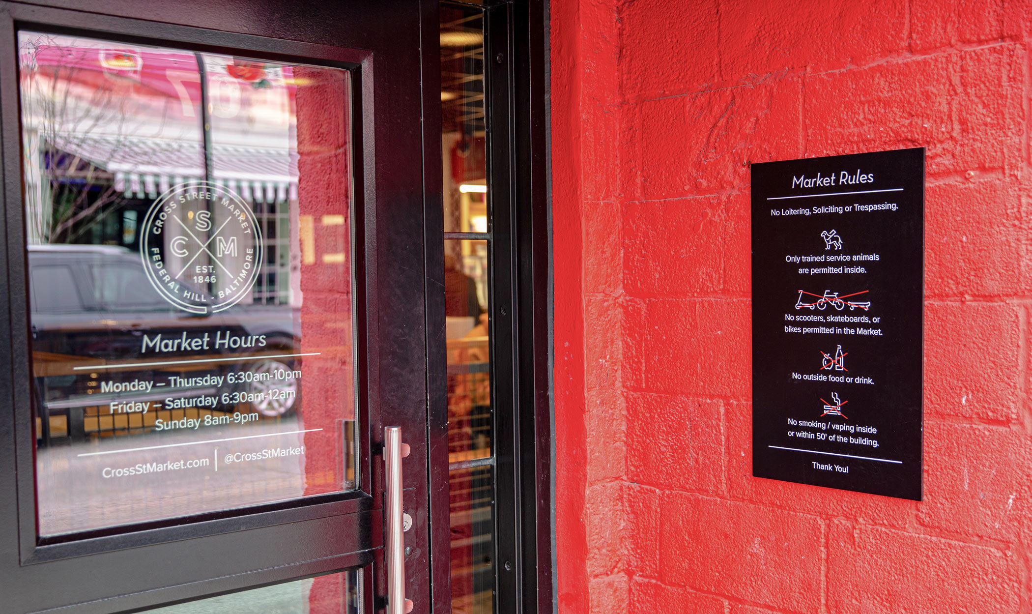
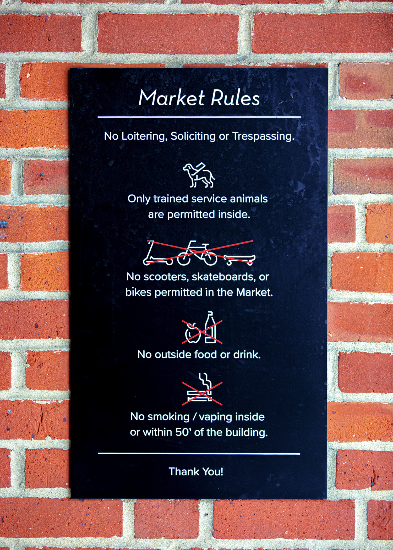
When developing a website for Cross Street Market, YDI made use of all branding elements. Consistent fonts, textures, and colors give a cohesive look, and the neon-inspired outlines of the market’s food icons find their way into informative web icons here. Visit the live site.