Stock and Grain
Completed Date
2021
Industry
Hospitality
Discipline
Experiential Design
Brand Design
Website Design
![](https://www.yountsdesign.com/wp-content/uploads/2019/12/StockGrain-SecondaryLogo.jpg)
![](https://www.yountsdesign.com/wp-content/uploads/2019/12/StockGrain-TertiaryLogo.jpg)
![](https://www.yountsdesign.com/wp-content/uploads/2019/12/StockGrain-CustomDovetailTypeface.jpg)
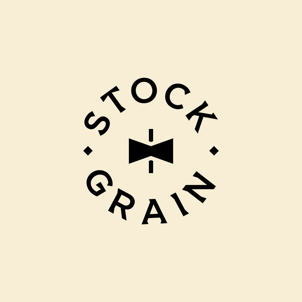
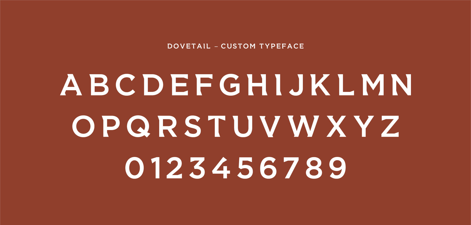
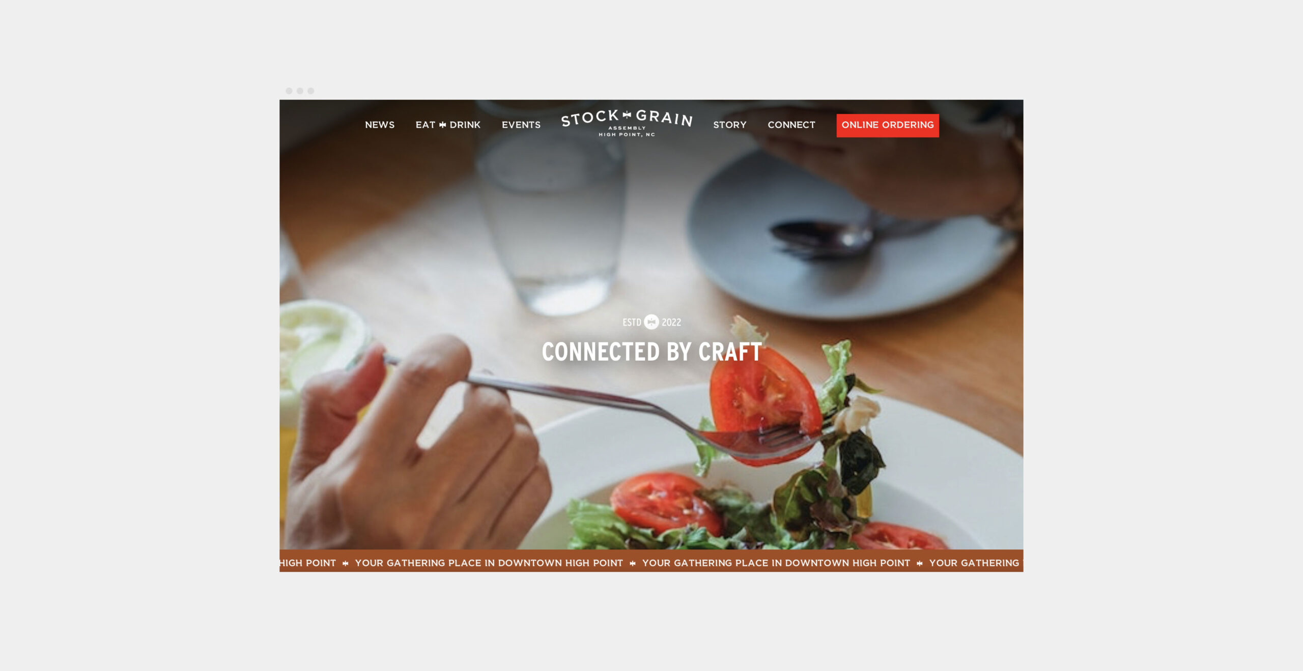
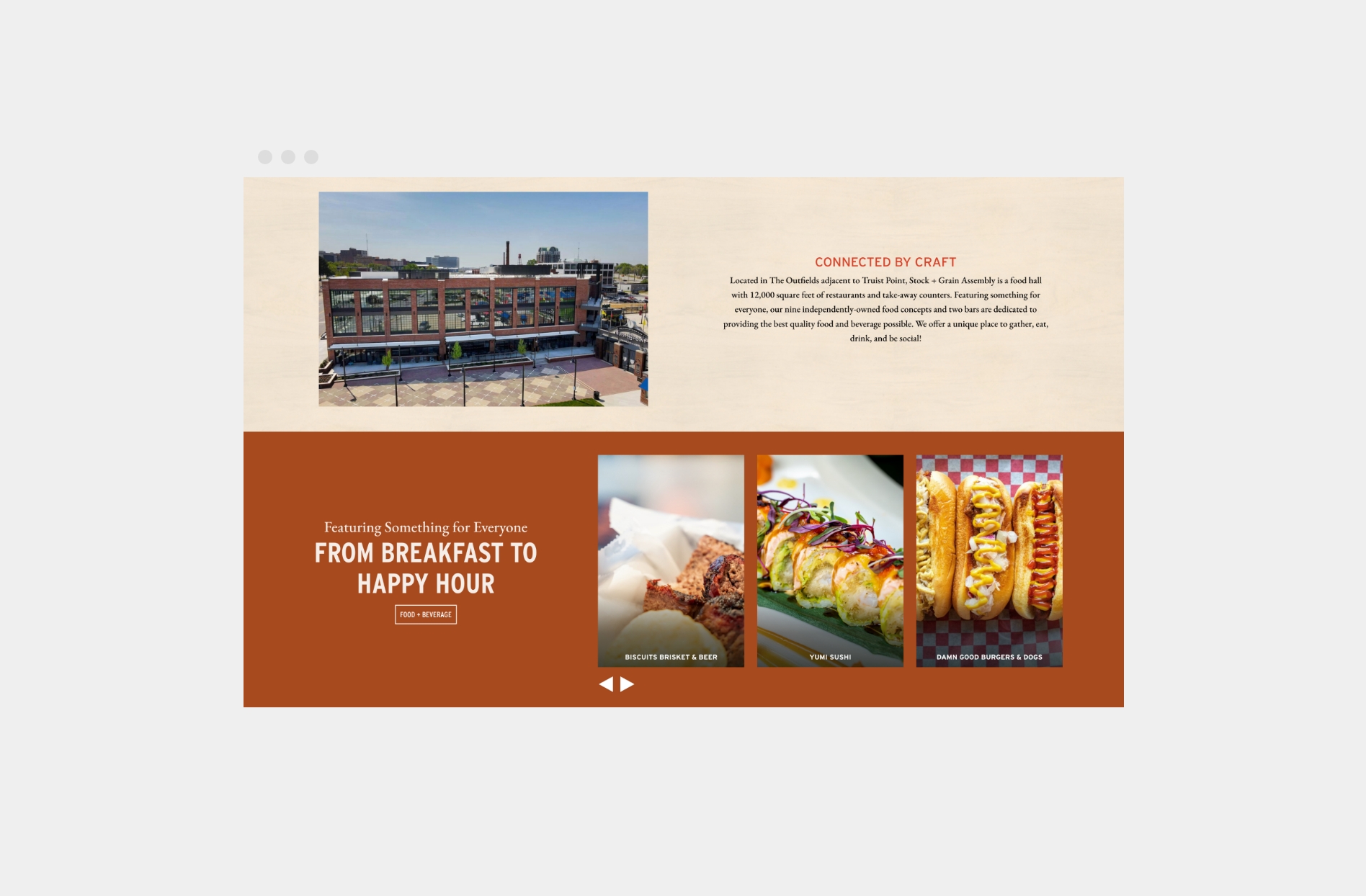
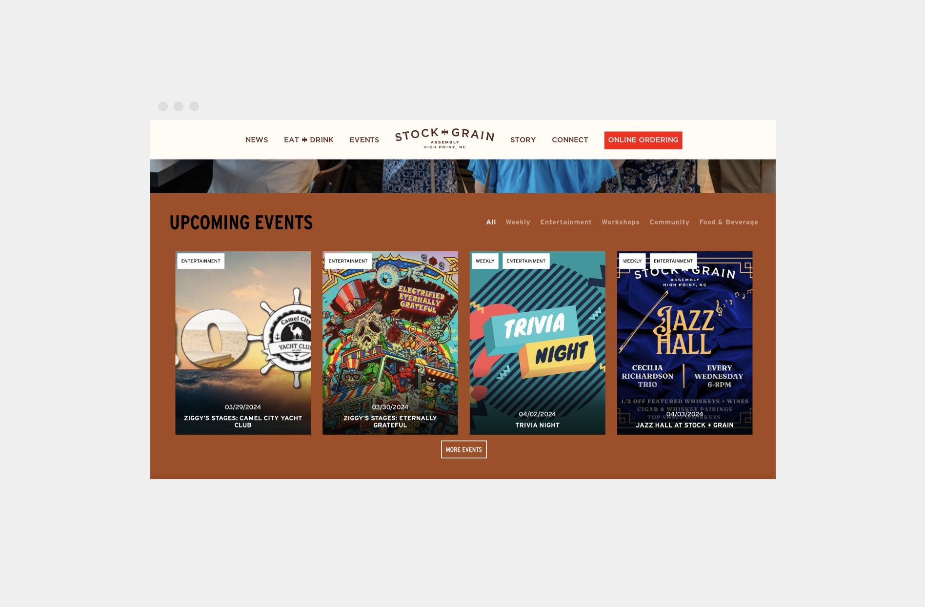
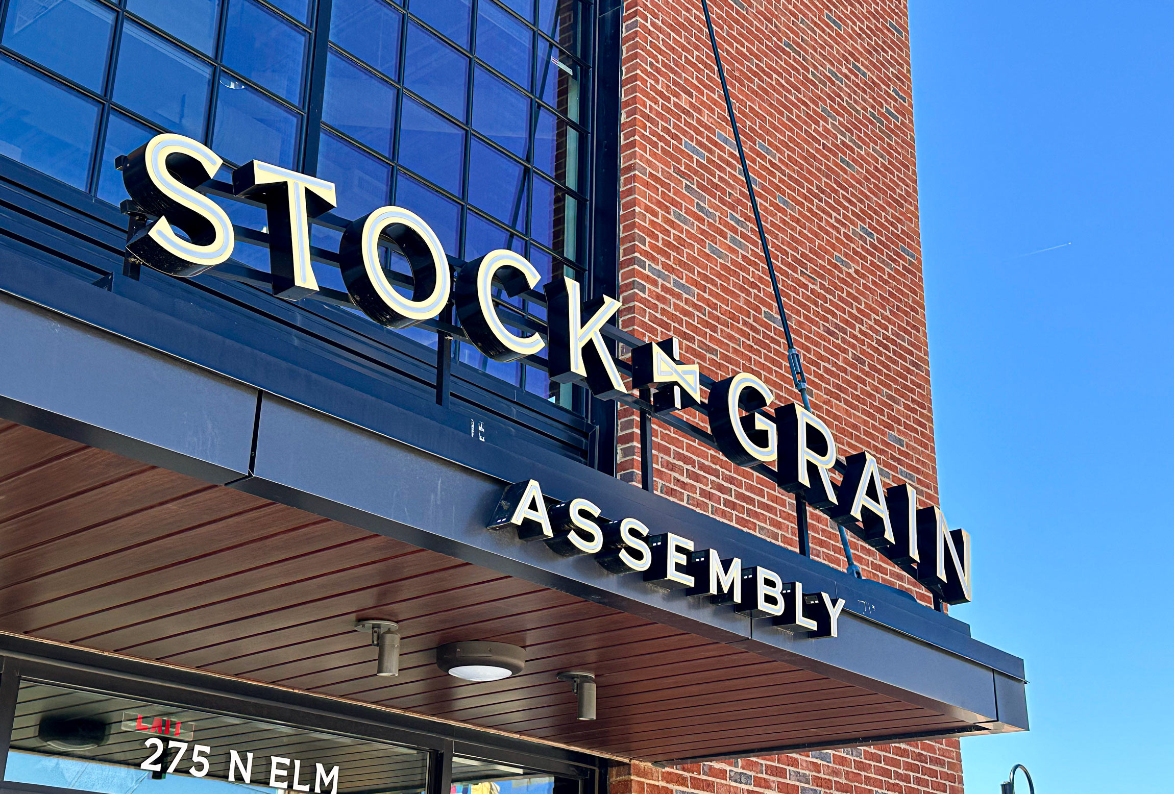
In addition to incorporating a dovetail form into the primary logo mark for Stock+Grain, a custom typeface was developed that takes inspiration from that shape. The result is a cohesive look across branding materials and signage, with a feel that is both sturdy and attuned to fine details. To support this throughout the physical space, YDI used stencil-inspired fonts to add to an atmosphere of craft and construction.
![](https://www.yountsdesign.com/wp-content/uploads/2019/12/entrance-sign-stock-and-grain-2x.jpg)
![](https://www.yountsdesign.com/wp-content/uploads/2019/12/stock-and-grain-directional-mural.jpg)
![](https://www.yountsdesign.com/wp-content/uploads/2019/12/stock-and-grain-hall-way.jpg)
![](https://www.yountsdesign.com/wp-content/uploads/2019/12/5e50.1920x1080.jpg)
![](https://www.yountsdesign.com/wp-content/uploads/2019/12/ab16.1920x1080.jpg)
These custom details were brought to the website that YDI built for Stock+Grain, as well. The project’s custom typeface features prominently, along with the brand’s signature palette and “Dovetail” icon. Visit the live site.
![](https://www.yountsdesign.com/wp-content/uploads/2019/12/home-1-scaled.jpg)
![](https://www.yountsdesign.com/wp-content/uploads/2019/12/home.jpg)
![](https://www.yountsdesign.com/wp-content/uploads/2019/12/event.jpg)